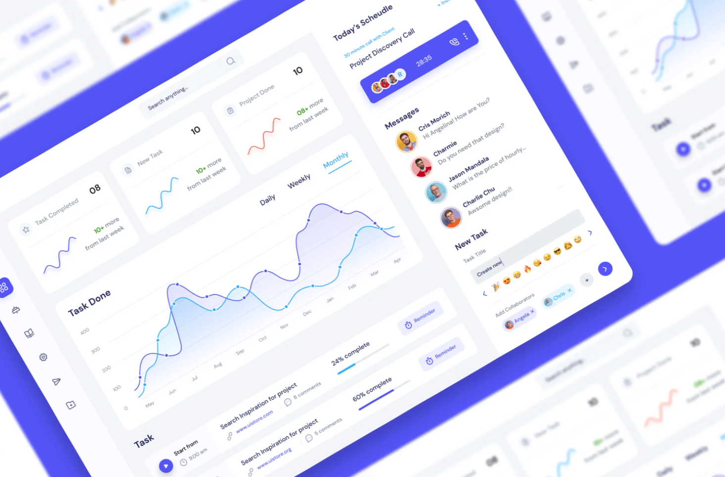
From Understanding Audiences to Mastering UI/UX: A Journey Through Engaging Report Design.
Crafting a Power BI report isn’t merely about showcasing numbers or charts. It’s an art where data is woven into a narrative that’s not just informative but also intuitive, accessible, and immensely valuable to its intended audience.
When you’re tasked with creating such a report, you’re not just providing data points. You’re curating a rich tapestry of information that’ll be frequently referenced, often mulled over, and always relied upon by a diverse spectrum of stakeholders. This platform is a unique avenue for you to not just highlight your analytical prowess but also to exhibit a deep understanding of business intelligence and the magic of storytelling.
Let’s embark on a journey through the nuanced corridors of UI and UX to make your Power BI report stand out.
1. Begin with the User’s Perspective

Understanding your audience is the cornerstone of any great report. Before the design phase, immerse yourself in understanding who your report speaks to. What are their primary questions? What consequential decisions hinge on your report? How well-versed are they with technology? And are there underlying strategic objectives to the report that go beyond the surface?
For instance, consider a scenario where your target audience comprises business professionals with a foundational understanding of economics but perhaps aren’t too tech-savvy. They aim to monitor metrics evaluating Canada’s economic health, understand the intricate dance between various economic indicators, and always have their fingers on the pulse of Canada’s current economic scenario. Beyond these primary objectives, a secondary yet subtle aim could be to flaunt your dashboard’s advanced features, such as search functionality, drill-down capabilities, multilingual support, and nuanced filtering.
2. Ascertain Power BI’s Suitability
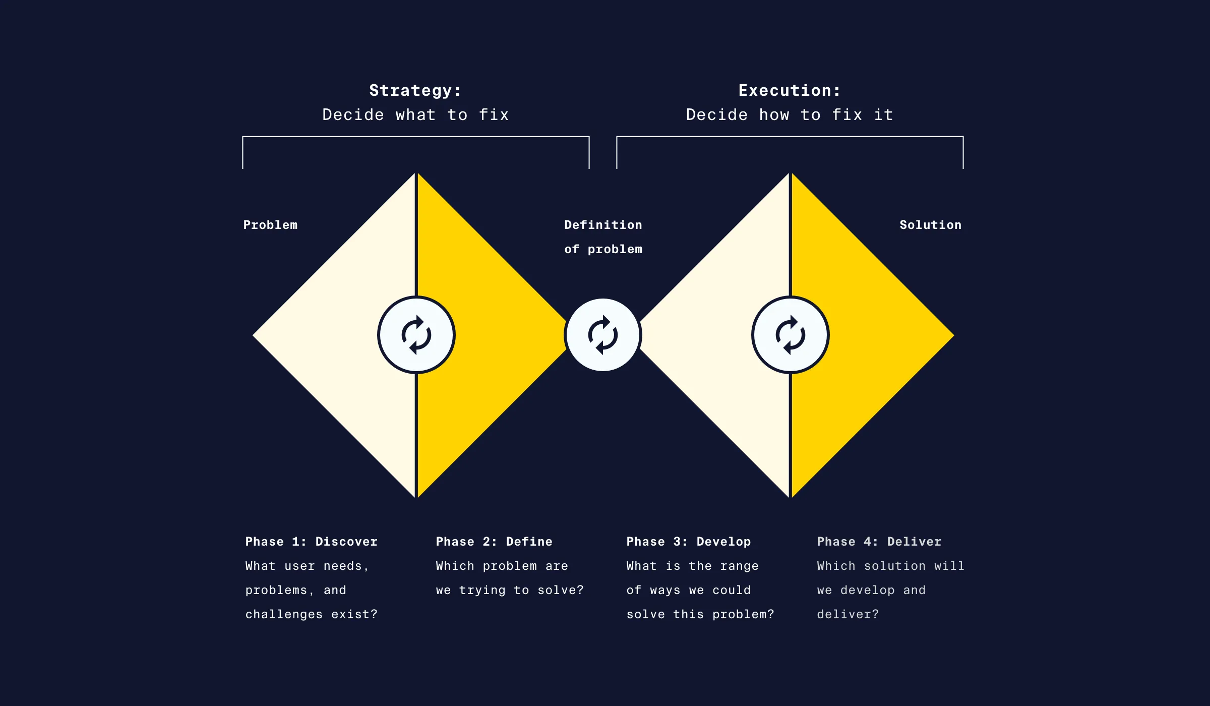
The enthusiasm around Business Intelligence tools is palpable, but it’s essential to pause and reflect if Power BI is the best foot forward. The double diamond design principle provides an insightful framework here. It urges you to adopt both divergent and convergent thinking. This ensures that while you’re deeply attuned to user needs and product objectives, you’re also open to considering various solutions and not prematurely fixating on Power BI.
3. Craft a Robust Information Architecture
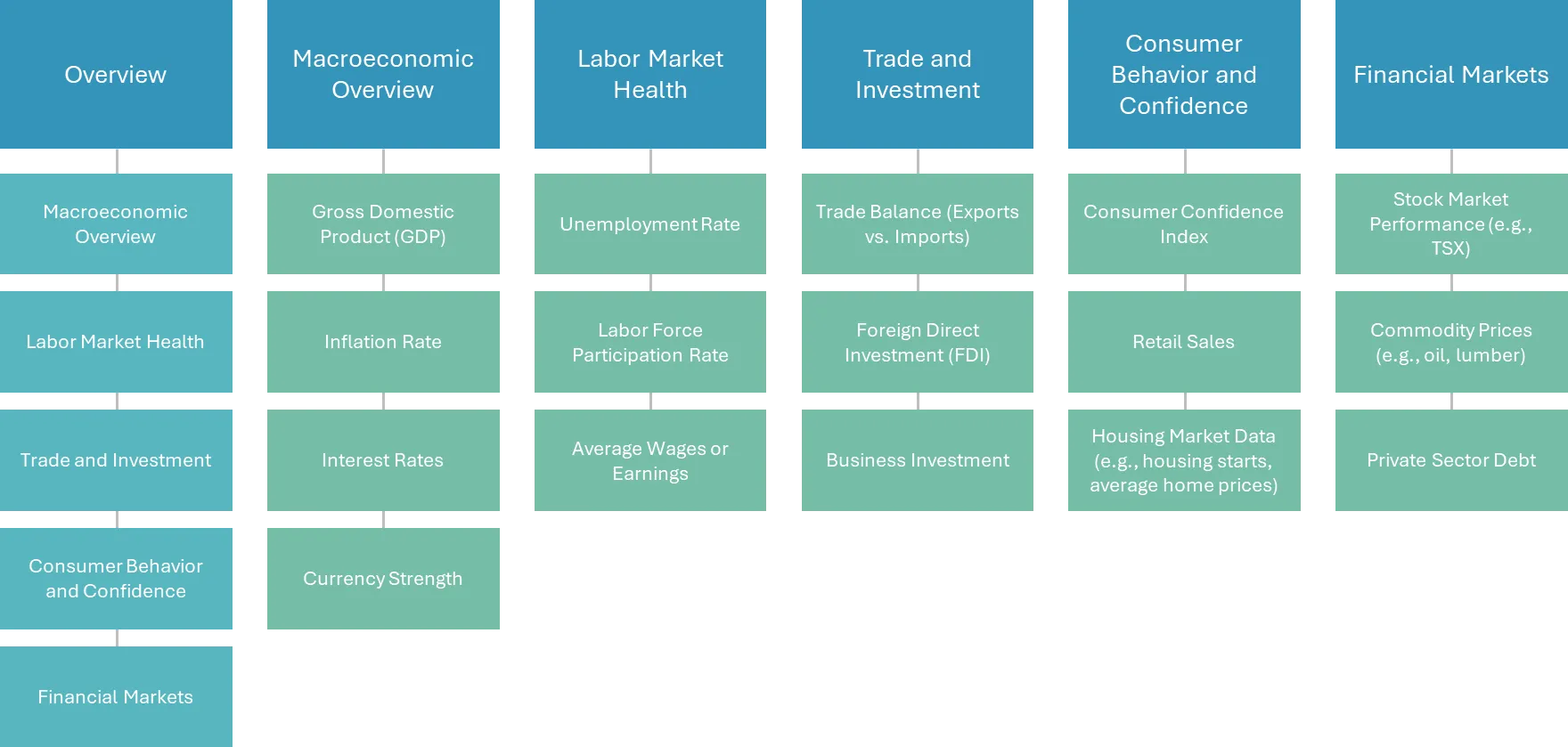
Once you’ve set the course, think of your report as an intricately designed building. The architecture matters. Determine the various sections of your report and the treasure of information each will hold. This phase also offers a fantastic opportunity to think of bridges between sections, enhancing the interactivity and dynamism of your report.
4. Draft a Low-Fidelity Sketch
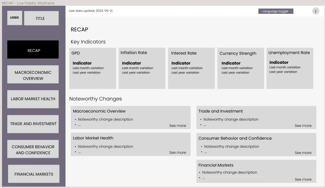
Before you dive deep into the Power BI ocean, chart your course on paper or digital tools like Figma. This preliminary sketch is your report in its infancy — a rudimentary layout detailing the pivotal components and their spatial relationships. While precision isn’t the goal at this stage, clarity certainly is. It provides a foundational blueprint from which the report can evolve.
Things to keep in mind at this stage:
Hierarchical Layout
Structure your report in a hierarchical manner, where the most important or summarised data is at the top or beginning and more detailed data follows.
Narrative and Storytelling
Use the data to tell a story. Arrange visuals in a logical order, provide context, and guide the user through the insights.
Mistakes to avoid at this stage


5. Elevate to a High-Fidelity Prototype
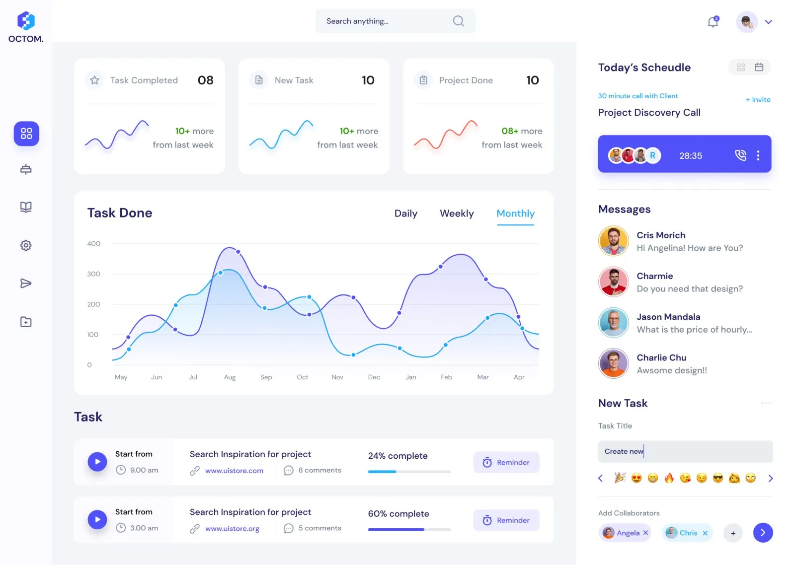
Based on feedback and introspection, refine and hone your initial design into a high-fidelity prototype. This version begins to resemble the final report more closely in look and feel. Here, the focus sharpens on maintaining visual consistency, ensuring seamless interactivity, and championing accessibility. Each visualisation, chart, and graph must be bathed in context — they should tell a story, provide insights, and offer value.
At this point, here are things to keep in mind when designing the high-fidelity sketch:
Effective Use of Visualisations
- Choose the Right Charts: Not all data suits a pie chart or a bar graph. Depending on the nature of your data and the story you want to tell, select the right visualisation.
- Avoid Overcrowding: Too many visuals on one page can overwhelm users. Aim for clarity.
Consistent Design
Maintain a consistent colour scheme, font, and layout throughout the report. This not only looks professional but also ensures that users don’t get distracted by changing styles.
Interactive Elements
Use slicers, drill-through, and tooltips wisely:
- Slicers: Allow users to filter data as they need.
- Drill-through: Enables users to click on a data point and see detailed data.
- Tooltips: Provide additional information when a user hovers over a data point.
Accessibility
Ensure your report is accessible to all users, including those with disabilities. This might involve:
- Using high contrast colours.
- Avoiding colour as the only method of conveying information.
- Providing descriptive text for visuals.
- Leveraging icons.
Provide Context
Always ensure there’s adequate context provided for each visualisation:
- Clear axis labels.
- Descriptive titles and legends.
- Annotations for any unusual data points or important insights.
6. Actualize the Power BI Report

With a clear vision in place, it’s time to breathe life into your report within Power BI. Performance becomes paramount here. Whether it’s streamlining bulky datasets, optimizing the visual count on a page, or ensuring swift data load times — every tweak enhances user experience. And before the final curtain rises, testing is crucial. It not only iron out kinks but also validates the report’s functionality, especially its interactive elements.
Here are some things to keep in mind:
Performance
- Minimise the use of very large datasets if not needed.
- Limit the number of visuals on one page. Different optimisation strategies can be used to limit the number of items on your Power BI report.
- Ensure report loads and filters quickly, as waiting for data to load can frustrate users.
Testing
Before finalizing the report:
- Test it with a few end-users to gather feedback.
- Ensure all links, buttons, and interactive elements work as intended.
Optimize for Mobile
If your audience will be accessing the report via mobile, ensure it’s optimized for smaller screens, with larger touch targets and a mobile-friendly layout.
7. Power BI Report Stewardship

A report’s journey doesn’t end at publication. Like any masterpiece, it needs care and feedback-driven refinement. Establishing feedback loops ensures the report remains relevant and useful, and continually evolves with user needs.
Conclusion
In summation, a Power BI report is a beacon guiding data-driven decisions. With a meticulous approach to UI and UX, as outlined above, your report won’t just deliver data; it’ll resonate, inform, and inspire its users.


