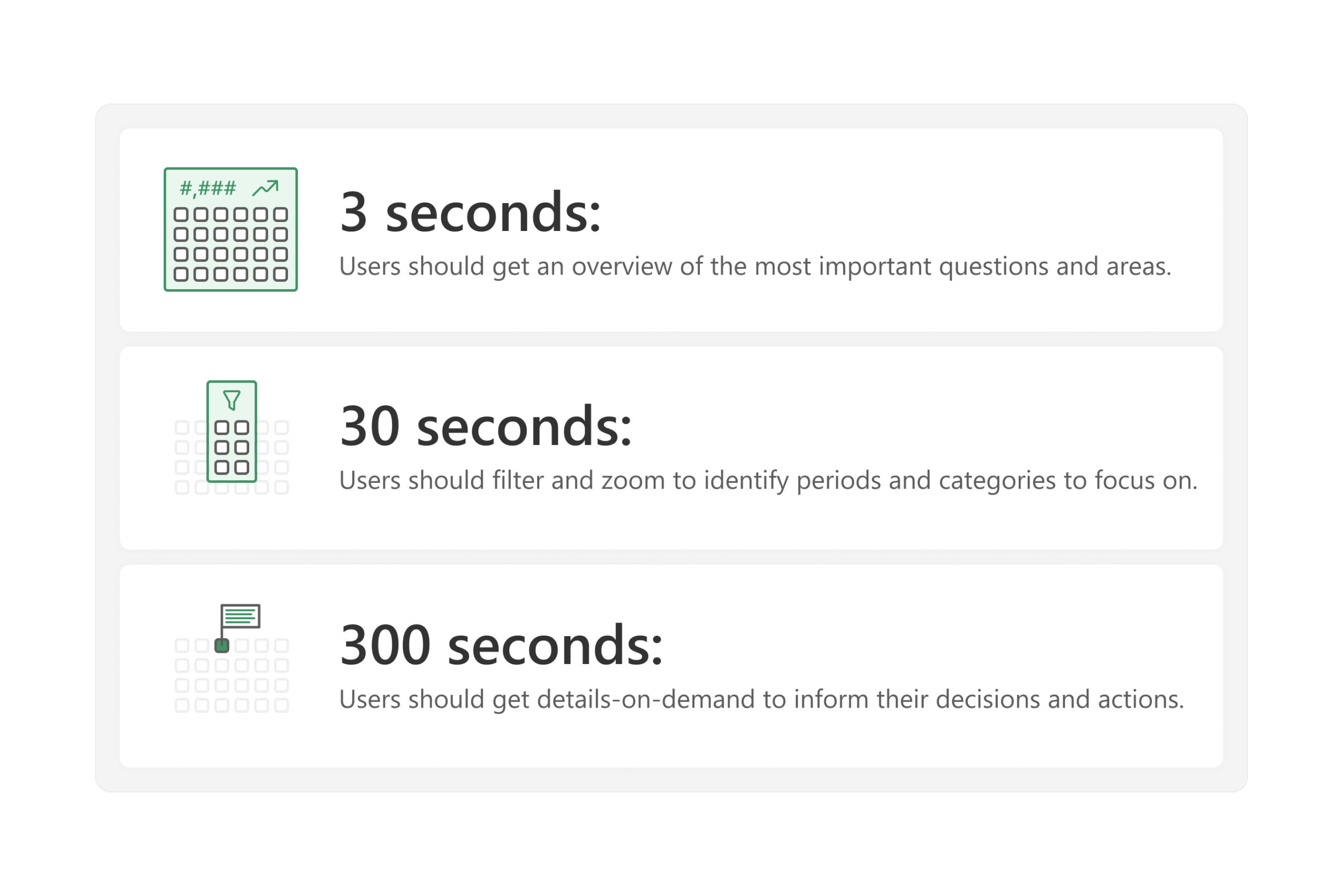
This article describes a simple approach that you can apply to improve your reports and dashboards. Effective reports and dashboards should enable users to quickly answer their data questions so that they can focus on their primary business tasks and responsibilities. To help you design effective reports, we introduce the 3-30-300 rule for information design. […]
A special case of the PARALLELPERIOD function: NEXTYEAR, NEXTQUARTER, NEXTMONTH and NEXTDAY — create a column with dates of the previous year, quarter, month and day. creating a column with the dates of the next year, quarter, month and day. PREVIOUSYEAR, PREVIOUSQUARTER, PREVIOUSMONTH and PREVIOUSDAY — creation of a column with the dates of of […]
Automated Theme Tagging: Visualising Insights from Survey Comments using ChatGPT and Python. Here, we’ll explore how you can seamlessly tag each survey comment with its corresponding key topic. This serves as an invaluable tool for crafting intuitive visualisations and dashboards. Starting Point: We have 107 survey comments saved in a CSV file. Step 1: Obtain […]
Transforming Data Interpretation: Enhancing Engagement, Insight, and Accessibility in Power BI Dashboards IntroductionThe digital age has magnified the importance of data, but the real power lies in how we interpret and act on that data. A dashboard’s primary role isn’t merely about displaying numbers — it’s about crafting an immersive and intuitive experience that translates […]
Visualization to help with project management Navigating the intricate landscape of project management in the dynamic business realm requires a comprehensive tool that not only captures the intricate interplay of tasks and timelines but also provides a visual roadmap for successful execution. In this case, even an advanced bullet chart won’t do the job because […]
From Emotional Resonance to User Accessibility: Mastering Color in Dashboards Understanding the Art of Color in Design Design is more than just aesthetics; it’s about communication. And one of the most potent tools in a dashboard designer’s arsenal is colour. Through colours, we can evoke specific emotions, draw attention, and even guide user interactions. Have […]


