This article describes a simple approach that you can apply to improve your reports and dashboards.
Effective reports and dashboards should enable users to quickly answer their data questions so that they can focus on their primary business tasks and responsibilities. To help you design effective reports, we introduce the 3-30-300 rule for information design. The 3-30-300 rule is a straightforward and practical approach for you to produce efficient report layouts by structuring reports in a functionally hierarchical way. This rule concisely paraphrases the visual information-seeking mantra from Ben Schneidermann (1996). To make it easier for Power BI developers to understand, we express this rule with respect to approximately how long it should take users to get certain information or perform certain tasks in a report.
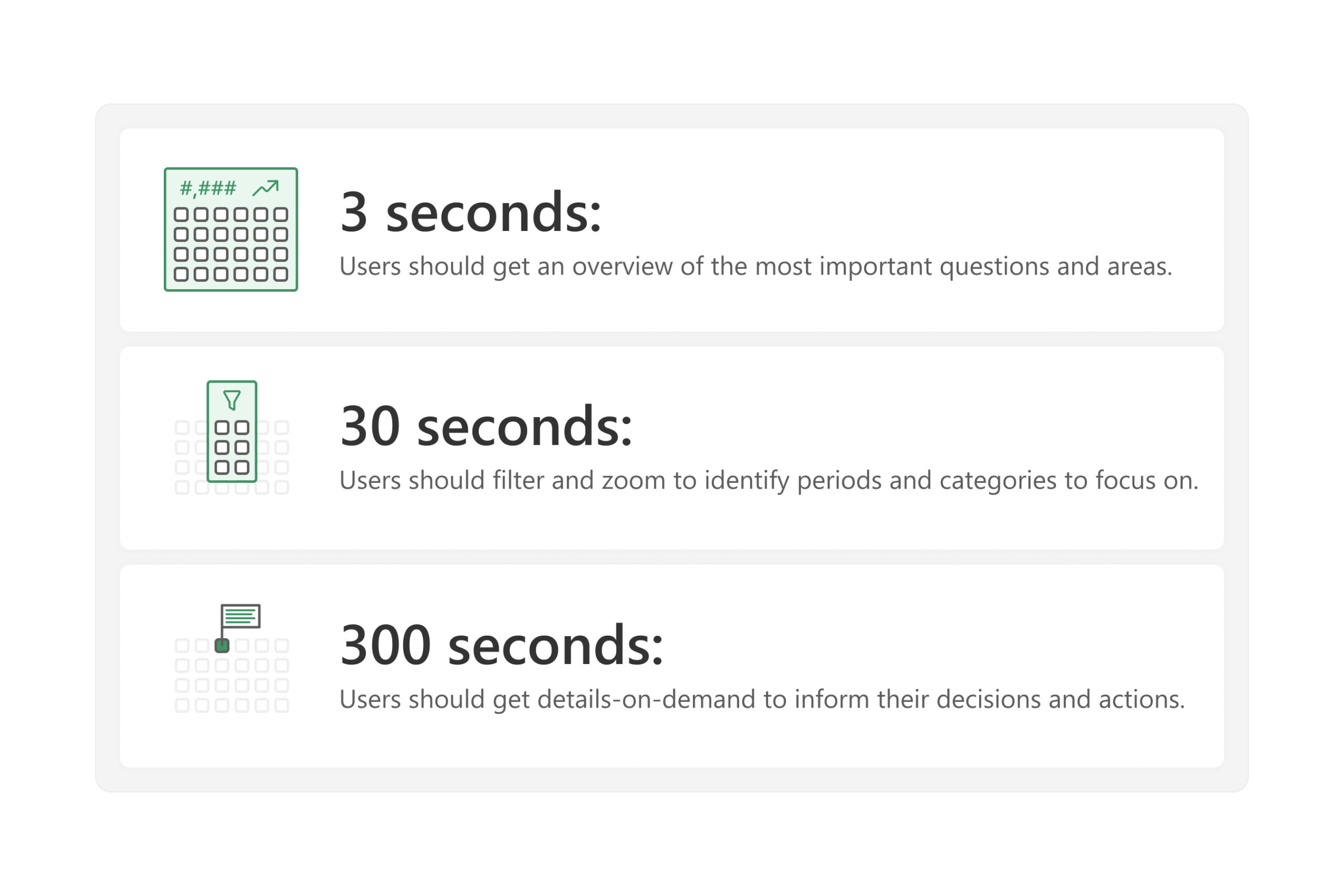
The 3-30-300 rule is summarized as follows:
- In 3 seconds: Users should get an overview of the most important questions and areas.
- In 30 seconds: Users should filter and zoom to identify periods and categories to focus on.
- In 300 seconds: Users should be able to get details on demand to inform decisions and actions.
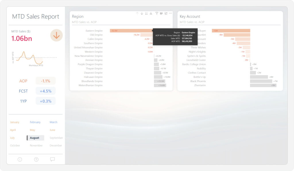
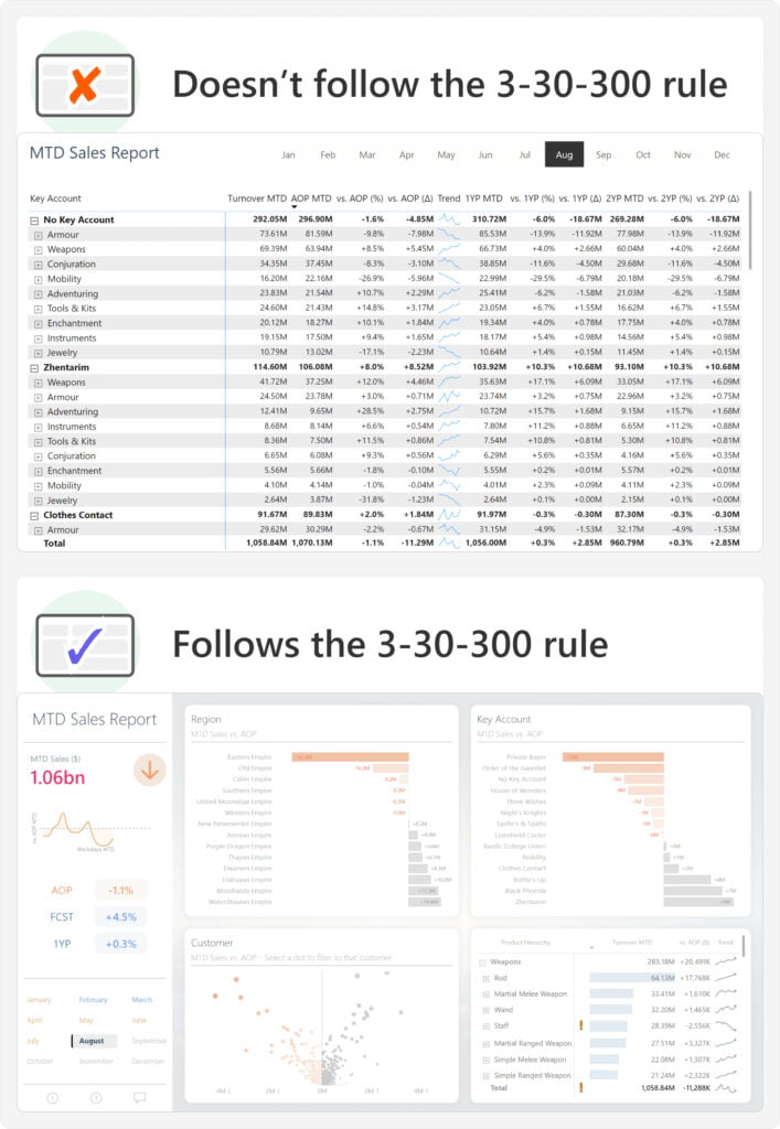
The seconds in this rule are intended to illustrate the concepts concretely; they are approximate and not literal targets. To show this rule in practice rather than explain the theory, consider the next image. The image depicts two example reports. The purpose of both reports is to show a high-level overview of the month-to-date (MTD) sales versus a target, the annual operating plan (AOP; also known as budget). These reports thus show similar data in different ways. One report follows the 3-30-300 rule, while the other does not. Look at these examples, and try to evaluate yourself which is which. When you look at these reports, try to answer two simple questions: What are the MTD Sales? and Are sales higher or lower than the AOP target?

The MTD sales are 1.06bn, which is currently below the target. Getting this simple information with the first report takes significantly longer than it does with the second one. This is because the second report follows the 3-30-300 rule. The second report is more efficient in this scenario for the following reasons:
- The most basic, important information is in the top-left corner as a large number. It is the first thing you look at.
- Colours and icons make it immediately evident to a reader if the MTD Sales are on target or not. They draw your attention and use implicit information to understand it.
- A trendline highlights whether the performance trend is getting worse or not. It’s quick and straightforward to see if the line is angled up (improving) or down (worsening).
- Breakdowns show the top and bottom regions and customers. Colour draws your attention to the underperformers.
- A matrix provides additional details in the bottom right; the last place you look. These details include the MTD Sales by product category, which allows a user to see product information immediately after cross-filtering on a specific customer.
The first report is more aesthetically pleasing and contains additional, sophisticated formatting compared to the second report. However, it takes a user longer to find even the basic information that they need. The first report—while nicer—is less useful. This demonstrates an important lesson when creating reports and visualizations: your primary objective is to make a useful report, not a beautiful report.
There are many benefits to creating elegant data visualisations. However, you will deliver value if you focus on effectively enabling your users to answer their questions, irrespective of your aptitude for design. What is important is that you ensure that the design and aesthetics of the report do not detract from the effectiveness of the user experience.
Later in this article, we explain step-by-step how to produce a report that is both elegant like the first report in the previous example, but also follows this 3-30-300 rule, like the second report. Generally, you can follow the 3-30-300 rule by observing the guidelines shown in the following diagram. Keep these guidelines in mind as you read the rest of the article and follow the examples throughout this article as we construct a report from start to finish. Note that there are many other steps and considerations that go into producing useful reports. In future articles and videos, we will elaborate further on these points.
The following image depicts some high-level guidelines to keep in mind that can help you to improve your report design. We will elaborate upon each of these points in detail in the context of the 3-30-300 rule, later.

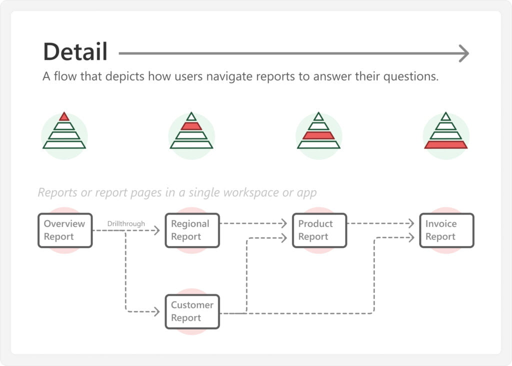
In addition to these guidelines that apply within a report, the 3-30-300 rule is also useful because it can apply across reports (or report pages). For instance, you can use this rule to provide a structured and hierarchical user experience in a report or Power BI app. Different views function to provide an overview, followed by more interactivity and detail. The following diagram depicts a high-level example of how this might look for a set of sales reports that focus on different perspectives, increasing in detail. A user can further leverage this by navigating from one report to another by using cross-report drillthrough, which lets them zoom in on specific categories and details.

The 3-30-300 rule can help Power BI developers of any skill level to develop better Power BI reports and apps that deliver more value for users and their organization. By adopting the 3-30-300 rule, you create better reporting experiences with minimal extra effort or design skills. In the rest of this article, we explain how you can follow this rule in your reports.
Before you start: Understand users’ questions
You cannot follow this rule if you do not understand the questions that users are trying to answer with data and analytics. As such, you need to first ensure that you define and understand these questions. This is typically something that you do during the planning and requirements gathering phase of your report. There are many equally valid ways to approach requirements gathering, although we recommend that you research existing reports while you talk with business users in informal, interactive meetings. During these meetings, your objective is to define and understand the following areas.

Consider the following straightforward example for a typical month-to-date (MTD) sales report:
- Process: A month-to-date sales process exists, where the business compares sales to monthly targets like budget (or annual operating plan), forecast, and previous years.
- Outcomes: The business wants to achieve these monthly targets.
- Users: Users comprise sales account managers and regional directors who are responsible for customer accounts and commercial regions that have their own targets that they should meet.
- Decisions and actions: Users must take a variety of decisions and actions to achieve their outcomes. Examples include:
– Planning sales actions with specific customers to get more sales.
– Planning marketing actions to obtain new customers and get more sales.
– Following up with supply chain teams to fulfil existing orders. - Problems and questions: Users must answer a variety of questions about sales achievement. Examples include:
– Are we achieving the MTD target?
– For which areas are we underperforming (or overperforming)?
– Why are these areas over- or underperforming? - Data: To answer these questions, users need specific data:
– Measures: Such as MTD Sales compared to the MTD annual operating plan (AOP).
– Dimensions: Such as region, customer, and product.
While the previous example is simplified for conciseness, it demonstrates the foundational business understanding that a Power BI developer needs to create the semantic model and subsequent reports. This is important to emphasize: without understanding the underlying business process, you are unable to produce good semantic models or reports that support it. To reiterate—you should try to talk with business users yourself to get this understanding.
Once you identify and understand the questions users want to answer, you can next proceed to design your report. The following sections provide additional details for how you structure a report to follow this 3-30-300 rule. Note that we illustrate these concepts by using a hypothetical example where we make decisions for simple chart types, formatting, and content. In reality, you should consider the input of your users to motivate these decisions. The example report we show in the following sections is not intended to be an example of an objectively “good” report, but rather to depict an example of one that follows the 3-30-300 rule and has an elegant design. The quality and design of a report are subjective to the users and their questions.
The example is different from the first two reports shown at the start of this article, to expose you to different types of designs and layouts for the same report.
3 seconds: Give an overview first
In three seconds, users should be able to get an overview of the situation and answer their most important questions. A common mistake is to either skip the overview (providing only breakdowns or tables) or attempting to provide an overview of everything. The key to a successful overview is conciseness and simplicity, and to treat user attention like a valuable resource we do not want to waste.
Considering our MTD sales example, the three second overview should enable users to quickly see the total MTD sales, and if they’re on track to meet their monthly target or not.

To do this, we position a few simple visuals in the top-left of the report, where most users first look upon opening it (as in the West, we read from top-left to bottom-right). Note that we chose to use a left-hand margin area, but we could have also positioned these visuals horizontally along the top, or a mix of both options. By simply glancing at this area, we can quickly see the total MTD Sales, whether the target is achieved, and if the situation is improving or not.
You consider the following additional guidelines to create a three-second overview:
- Use simple chart types—like cards or line charts.
- Arrange these simple charts in the top-left of the report page.
- Use formatting that leverages pre-attentive attributes, which are properties that help us to steer attention to important numbers or areas. Common examples include:
– Colour hue or saturation in conditional formatting.
– Symbols (like arrows) in format strings.
– Trend lines that go up or down.
– Bar lengths in bar or column charts. - Use clear labels and formatting of numbers, so that users can quickly read and interpret them.
You avoid the following issues with a three-second view, to ensure it is effective:
- Placing too many visuals, which take too long to read and interpret.
- Using too many labels or too much formatting quickly becomes overwhelming.
- Placing slicers, buttons, text, or logos in the top-left, takes up valuable space and quickly clutters the page.
The purpose of a good three-second overview is to give a clear picture of the overall situation as quickly as possible. Users should be able to glance at the report to answer important, high-level questions. Then, based on what they see, users decide whether they want to further investigate, by using filters and drilldowns for specific categories.
30 seconds: Filter and zoom next
In 30 seconds, users should be able to filter and zoom to the areas that are important to them. These important areas are typically where they might need to make decisions or take actions to achieve some desired result. A common mistake here is to immediately provide a lot of details in tables, matrixes, or highly-interactive visual types, such as the decomposition tree. The problem with this is information overload. Reports with information overload force users to dig through the data and filter pane to find what they need. Playing Where’s Wally with numbers like this is often what drives many users to export to Excel, where they have Ctrl+F and pivot tables to more quickly find what they need.
Continuing with our example, the 30-second part of the MTD sales report should enable users to filter and zoom into relevant categories, like region and customer hierarchies. Colors and formatting should draw their attention to what’s important. Then, interactions should allow them to filter and zoom into these important categories.

To do this, we use visuals to identify the customers and regions that are under or overperforming. Specifically, we use bar charts that show the MTD Sales vs. AOP by region and customer hierarchies. Conditional formatting draws attention to regions- or customers of interest. Users can drill down the hierarchies for additional detail, hover for tooltips that provide contextual information, or select a specific category to cross-filter the rest of the report to that category. Additionally, they can filter the report from the filter pane. If we want users to be able to view different targets (like a comparison to the forecast or one year prior), we can also let the user dynamically change the target by selecting them on the left-hand pane, for example by using navigation buttons, calculation groups, or field parameters.
Note that there are many different ways to represent this data rather than a single bar chart. Bar charts are shown here because it is the simplest and most common solution that anyone can implement in a report. However, you might also choose to use one of the many alternatives, such as a bar chart with variance, a bullet chart, or a connected dot plot (also known as a dumbbell chart). Be aware that many of these alternatives might require additional effort to develop and support since they are not default options among the Power BI core visuals.
You should consider the following additional guidelines to create a 30-second view:
- Limit details and chart formatting to be consistent and only show what is necessary.
- Use clear chart titles, axes, and data labels.
- Provide supplemental information in tooltips or drill through pages.
- Conditionally format categories that users may want to filter on and investigate further.
- Train users to use interactions like cross-filtering, slicers, filters, and drill-downs.
You should avoid the following issues with a 30-second view of the report, to ensure it is effective:
- Do not place too many visuals, which create an unfocused experience.
- Do not use too many interactions, which confuse a user.
- Do not provide redundant or excessive information, which is less efficient to read and interpret.
The purpose of the 30-second part of the report is to highlight specific categories where users can request more detailed information that informs their decisions or actions.
300 seconds: Facilitate details-on-demand
In 300 seconds, users should be able to get details-on-demand for the filtered areas they want to investigate. A common mistake here is to provide un-curated, unformatted tables that drown users in a sea of numbers. Additionally, many report developers insufficiently connect the 30-second “filter” step with the 300-second “details” step. This happens when users must re-apply their filters, or search again for information they already had available on another view or report. Ideally, the flow from 3 to 30 to 300 is as fluid and convenient as possible. This flow should conclude as closely as is feasible with the downstream actions that users take based on the data.
Concluding our MTD sales report, the 300-second view should allow users to efficiently obtain sales details for one or more regions and customers. As such, we have to ensure that we do not just deliver details, but that we provide a way for the most important details to rise to the surface. Furthermore, the delivery of these details should be specific enough to focus on the problems, while also being flexible enough to support the most common use cases; we cannot show everything.

To do this, we create a volcano plot to quickly identify customer accounts that warrant further investigation from the hundreds of customers that we sell to. A details matrix in the report is the final visual, which provides supplemental information. This matrix is concisely and elegantly formatted and responds to cross-filtering and other interactions. It consists of details by product category, to quickly identify which products are underperforming (or overperforming) within a customer. Finally, drillthroughs are enabled by region and customer to get a full customer profile (including contact information) and multi-year trends. Cross-report drillthroughs allow users to cross-interrogate supply chain reports to check inventory and demand planning for underperforming product categories for certain customers.
You should consider the following additional guidelines to create a 300-second view:
- Format tables concisely, by removing unnecessary elements and focusing on key figures.
- Apply model perspectives and use Personalize visuals so that users can adjust table contents, themselves.
- Use drillthroughs (both within and across reports) for other analyses or more details, and train users to use them effectively.
- Link to other supplemental information with dynamic URLs in matrixes, tables or buttons.
- Train users to export only when they need to, using live connected tables.
You should avoid the following issues with a 300-second view in the report, to ensure it is efficient:
- Do not use too many categories or values in a table or matrix.
- Do not use drillthroughs that carry unnecessary filters across report pages or reports.
- Do not provide “data dump” pages specifically made to export to Excel.
Once finished the 300-second view, we now have a complete report that is much improved compared to if we tried to show everything in one big table or matrix, as in the top example of the following image.

A table or matrix can still be useful in reporting. Typically, this is the case only once a user has a clear view on the overall situation, and where they want to focus. For instance, they might perform a drillthrough to such a table or matrix to get details-on-demand, as part of the 300-second view. However, tables and matrixes alone are not a replacement for effective reports and dashboards.
The final result (on the bottom) is also much better than another report that could be just as elegant, but much less useful, as it focuses more on aesthetics instead of answering the right questions in the most effective way possible.

To reiterate: by design, the report in this example does not answer all questions about the MTD sales process for all users. Instead, it is tailored to address a set of key questions and problems, enabling a target audience to make decisions and take actions quickly and conveniently. Similarly, reports you make should also not be designed to address every possible question.
Conclusion
A useful report is convenient for users and allows them to efficiently answer their questions. While many factors and steps go into making a good report, one big step towards this is to use the 3-30-300 rule, or the visual information-seeking mantra. This is a straightforward approach that helps you to organize your report in a useful way, so that users can find what they need. By adopting the 3-30-300 rule, a developer of any skill level can already greatly improve their reports and dashboards with minimal extra effort or design training.


