
People Analytics Dashboard: How To Build One That Works for You
Companies that invest in advanced people analytics are significantly more likely to see higher productivity—up to eight times greater—and are also nine times better equipped to handle change. The first step toward reaching this level of maturity is implementing a thoughtfully designed people analytics dashboard.
A well-designed people analytics dashboard enables organisations to gain deeper insights into their most important asset — their workforce. Yet, despite investing heavily in HR systems, only around 1 in 10 businesses track their people with the same rigour applied to areas such as supply chain performance or customer retention.
To shift this reality within your organisation, adopting the right people analytics dashboard is key. In this article, we’ll look at the advantages it brings to HR and the wider business, along with practical guidance on how to design and make the most of one.
What is a people analytics dashboard?
People analytics is the practice of gathering workforce data and applying the insights to guide strategic, evidence-based decisions around human capital. It also highlights HR’s role as a strategic partner to the business.
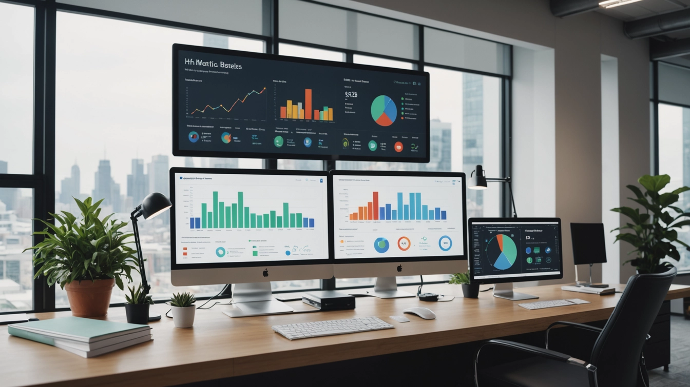
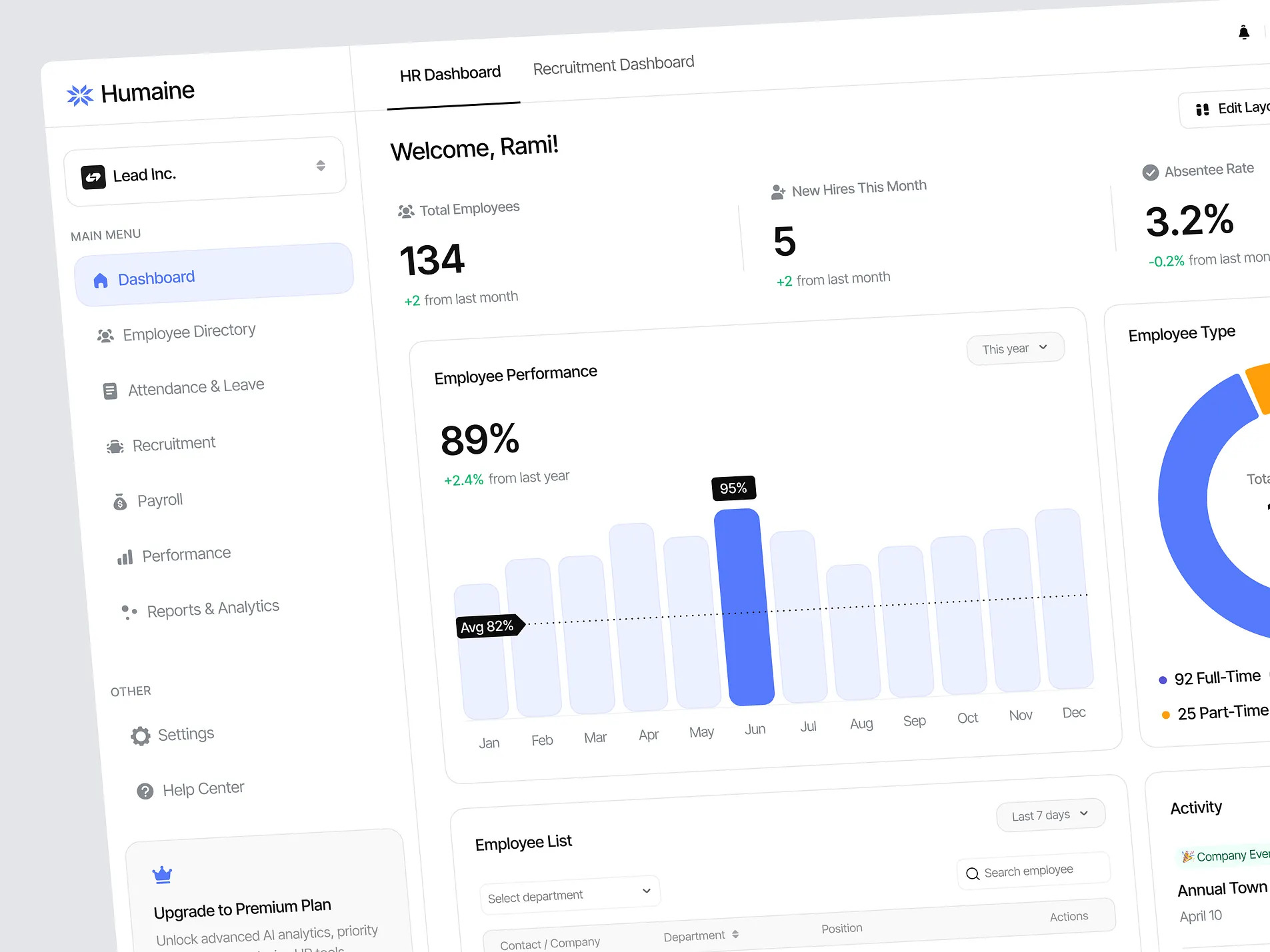
A people analytics dashboard is a digital platform that allows HR teams to access and analyse live workforce data from multiple sources. By presenting key metrics such as headcount, attrition rates, and employee engagement in clear charts and visuals, it makes trends, risks, and opportunities easier to spot and act upon. As HR continues to move towards data-driven practices, these dashboards are set to become an integral part of future workforce analytics.
How Does a People Analytics Dashboard Support HR?
An HR analytics dashboard brings a wide range of advantages, including:
- Better decision-making – With real-time insights at hand, HR leaders can make confident, evidence-led choices.
- Stronger workforce planning – Dashboards enable skills gap analysis, help optimise staffing levels, and provide forecasts for future workforce requirements.
- Improved retention – Analytics can highlight turnover risks, allowing proactive action to retain talent, while also identifying high-potential employees.
- More effective DEIB strategies – Real-time diversity metrics allow HR to measure progress and refine diversity, equity, inclusion, and belonging initiatives.
- Greater HR efficiency – Automated reporting and a centralised data hub save time, cut costs, and allow the team to focus on strategic priorities.
- Closer alignment with business goals – Using people data to guide decisions ensures HR strategies are more tightly connected to overall business objectives.
- Clearer stakeholder communication – Dashboards simplify complex information, making it easier for leaders and stakeholders to understand and engage with workforce insights.
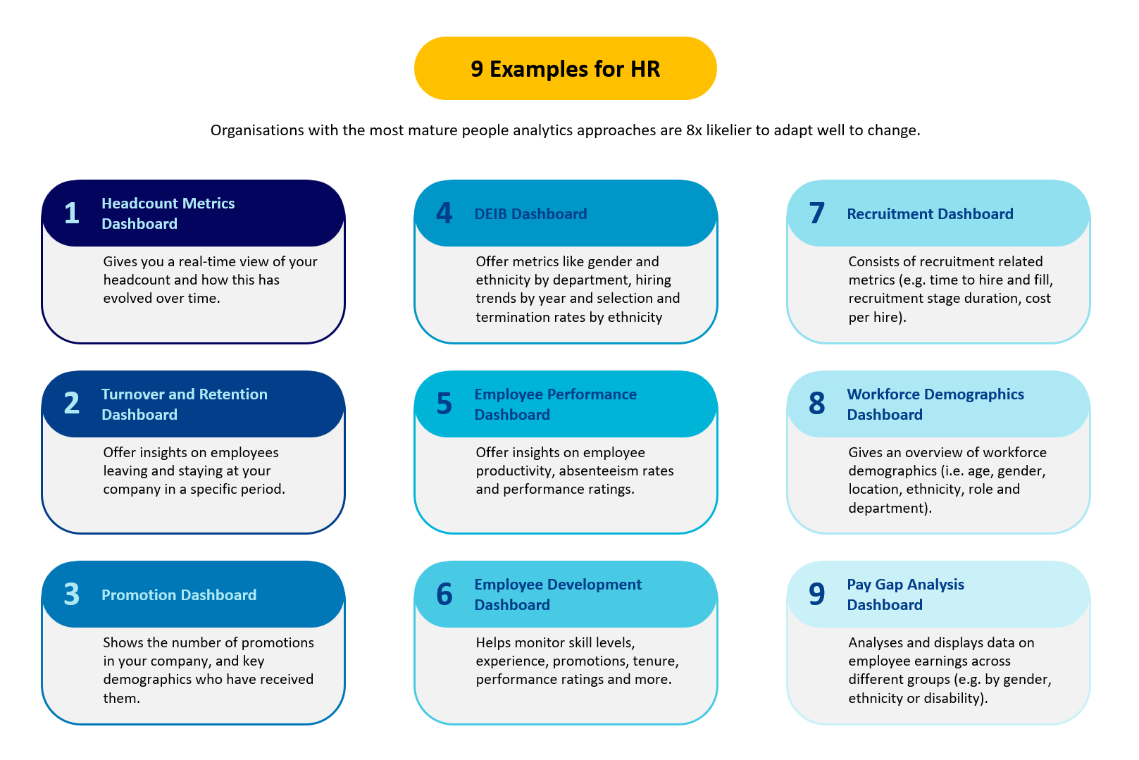
9 Examples of People Analytics Dashboards
To better understand their value, let’s look at some commonly used people analytics dashboards, how they function, and the challenges they help HR teams address.
Example 1: Headcount Metrics Dashboard
This dashboard gives an up-to-date snapshot of workforce size and composition. It allows you to monitor headcount trends month by month or year on year, while also showing the balance between full-time, part-time, and contract employees. In addition, it can highlight performance levels and time since each employee’s last promotion, making it easier to recognise high performers and spot those ready for progression.
Example 2: Turnover and Retention Dashboard
This dashboard should provide clear visibility of workforce stability by showing who is leaving, who is staying, and the underlying reasons. It enables you to track monthly turnover patterns, compare them against previous years, and break down the data by department or role. By highlighting areas with higher attrition and surfacing common causes — such as excessive workloads, performance challenges, or more attractive offers from competitors — it equips HR teams to take timely and targeted action.
Example 3: Promotions Dashboard
A promotions dashboard tracks career progression across your organisation, breaking down promotions by factors such as gender, age, education, and department. This helps identify potential biases or imbalances in promotion practices. Managers can use the dashboard to monitor employee development and skills growth over time, while employees gain clarity on career pathways and the steps needed to advance.
Example 4: DEIB Dashboard
A Diversity, Equity, Inclusion, and Belonging (DEIB) dashboard monitors key metrics such as gender and ethnicity across departments and job levels, as well as trends in hiring, promotions, and departures. It provides a clear picture of how inclusive your practices truly are. For instance, if promotions predominantly favour one group while other employees leave at higher rates, the dashboard highlights areas that require urgent attention and action.
Example 5: Employee Performance Dashboard
An employee performance dashboard provides insights into key metrics such as productivity, absenteeism, overtime, and performance ratings. It enables HR teams to identify top performers, monitor trends over time, and compare performance across different teams. Additionally, it supports setting benchmarks, enhancing overall performance, and addressing issues promptly before they escalate.
Example 6: Employee Development Dashboard
An employee development dashboard tracks skills, training completion, promotions, job satisfaction, and performance. It allows you to assess how training impacts performance and identify which development programmes are delivering results. HR teams can use this insight to optimise learning initiatives, support employee growth, and ensure development efforts align with broader business objectives.
Example 7: Recruitment Dashboard
A recruitment dashboard tracks key hiring metrics such as time-to-hire, duration at each recruitment stage, cost per hire, and monthly offers. It helps HR teams identify sources of top talent, streamline the recruitment process, and manage costs effectively. Additionally, it highlights areas of weakness, allowing you to enhance the candidate experience and strengthen your employer brand.
Example 8: Workforce Demographics Dashboard
A workforce demographics dashboard provides a comprehensive view of your entire workforce, covering factors such as age, gender, location, ethnicity, role, and department. It enables HR teams to track trends and changes over time, while spotting any imbalances or disparities. This insight supports initiatives to build and maintain a diverse and inclusive workforce.
Example 9: Pay Gap Analysis Dashboard
A pay gap analysis dashboard presents employee salary data across different groups, such as gender, ethnicity, or disability. It offers insight into the fairness of your organisation’s pay structures and policies across roles and departments. By identifying disparities, uncovering the reasons behind them, and taking corrective action, HR teams can promote pay equity and transparency.
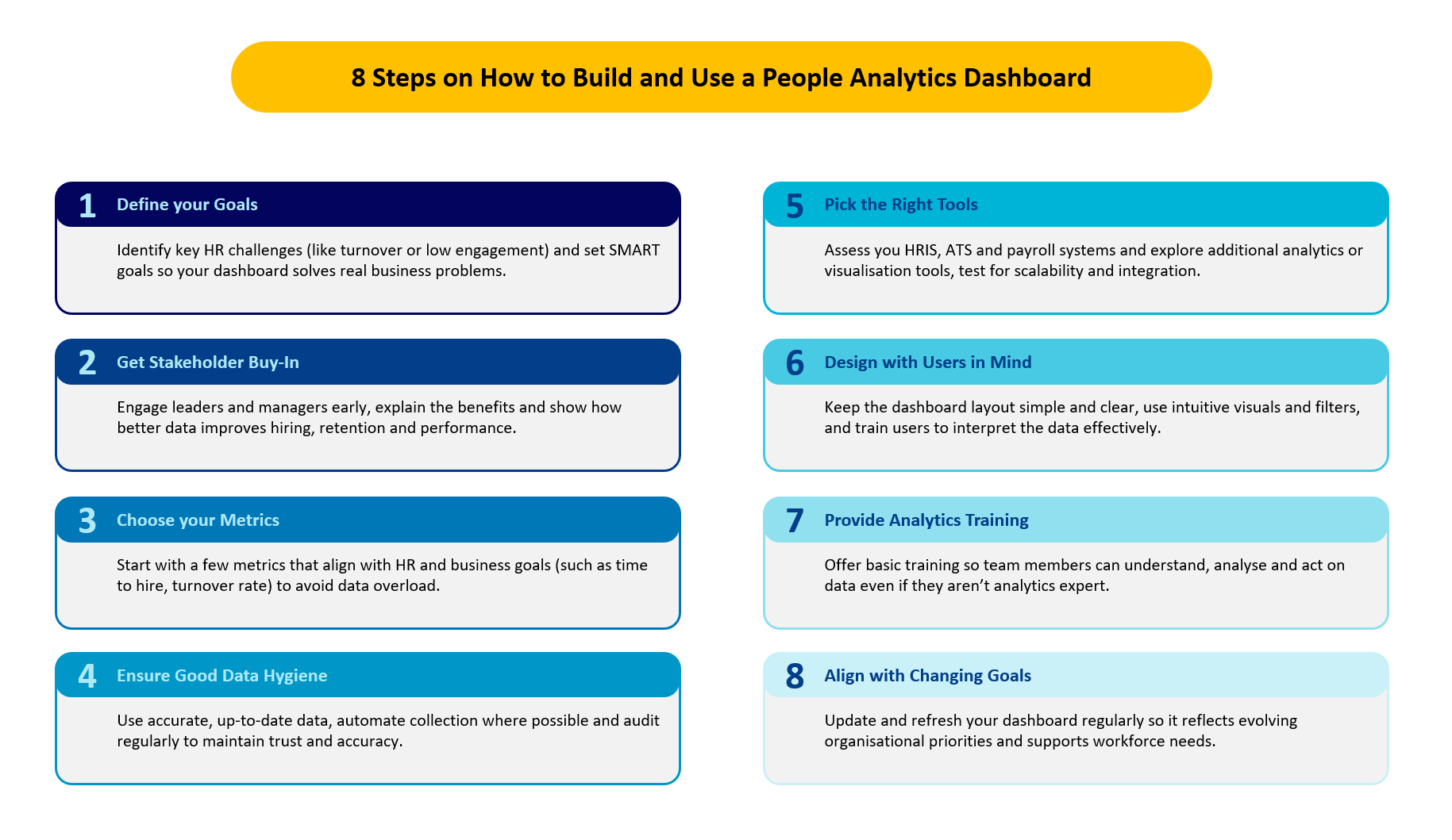
How to Build and Use a People Analytics Dashboard
Here are some practical tips for creating and leveraging an HR analytics dashboard within your organisation.
Define your objectives clearly
Begin by pinpointing the specific challenges your organisation faces — for example, high turnover, low engagement, or limited internal mobility. Once identified, set SMART HR goals to ensure your dashboard addresses real issues rather than simply tracking data for its own sake.
Secure stakeholder support early
Engage leaders, department heads, and managers before building the dashboard. Explain how people analytics can inform better business decisions and what insights they can expect. Demonstrating the link between data and outcomes such as improved hiring, retention, and performance will encourage buy-in and increase the likelihood that the dashboard will be actively used.
Select metrics strategically
More data isn’t necessarily better. Focus on metrics that directly support HR and business objectives, such as time-to-hire, turnover rate, or employee engagement scores. Starting with a smaller set of key metrics makes the dashboard easier to manage and interpret. Additional metrics can be added later once your team is familiar with the system.
Maintain strong data hygiene
The value of your dashboard depends on the quality of its data. Ensure all information is accurate, up to date, and free from duplicates or inconsistencies. Automate data collection and updates where possible, and regularly audit your sources to maintain trust in the insights generated.
Choose the right tools
Evaluate your existing systems, such as your HR Information System (HRIS), Applicant Tracking System (ATS), or payroll software, to determine what data they can provide. Consider additional tools, such as data visualisation platforms or dedicated people analytics solutions, to fill any gaps. Test functionality, scalability, and ease of use through free trials before committing.
Design for the user
Keep the dashboard layout simple and focused on user needs. Use clear labels, readable charts, and filters that allow users to concentrate on relevant data. Provide training to ensure users understand the insights and know how to act on them. The easier the dashboard is to use, the more valuable it becomes.
Provide basic analytics training
Research shows only a small percentage of managers can analyse and interpret data, and even fewer companies offer training. Equip your team with fundamental skills in using the dashboard, interpreting data, and updating systems. A basic understanding ensures more informed, data-driven decisions across HR.
Keep the dashboard aligned with business goals
Your dashboard should evolve alongside organisational objectives. Regularly refresh data and adjust metrics to reflect changing business priorities. This ensures your people analytics continue to enhance processes, improve the employee experience, and support overall business performance.
HR Dashboard Software to Support People Analytics
Here are some types of HR dashboard software your team can use to enhance their people analytics strategy:
Power BI – Power BI combines advanced analytics, AI tools, and an intuitive report builder to support a data-driven culture. It scales easily, integrates with other Microsoft services, and ensures robust data governance and security.
Tableau – Tableau, the first agentic analytics platform, features best-practice visualisations, integrated AI/ML capabilities, and strong governance tools. It also supports visual storytelling and offers access to a global Tableau Community for collaboration and knowledge sharing.
Crunchr – Crunchr consolidates and cleans all your workforce data into a single source of truth, unlocking AI-driven insights. It offers hundreds of pre-built custom dashboards and includes an AI assistant to answer questions on recruitment, retention, and more.
Lattice – Lattice centralises employee demographics, performance, engagement, and career progression into interactive dashboards, providing a holistic view of your workforce in real time. Its adoption dashboard helps improve participation in people programmes and maximise their impact.
Visier – Visier enables organisations to build, scale, or extend their people analytics strategy quickly. It automates analytics, delivers actionable insights, and supports retention, internal mobility, and talent acquisition optimisation.
In Summary
A people analytics dashboard empowers HR teams to work more efficiently, make informed decisions, enhance employee retention, and align more closely with overall business objectives. To maximise its value, treat your dashboard as a dynamic, ongoing tool rather than a one-off project.
Continuously refine your metrics, update data sources, and adapt the dashboard as your organisation evolves. Regularly involve your team, assess what’s working and what isn’t, and implement changes that reflect the organisation’s real priorities. The more you iterate, the more impactful and insightful your people analytics dashboard will become.