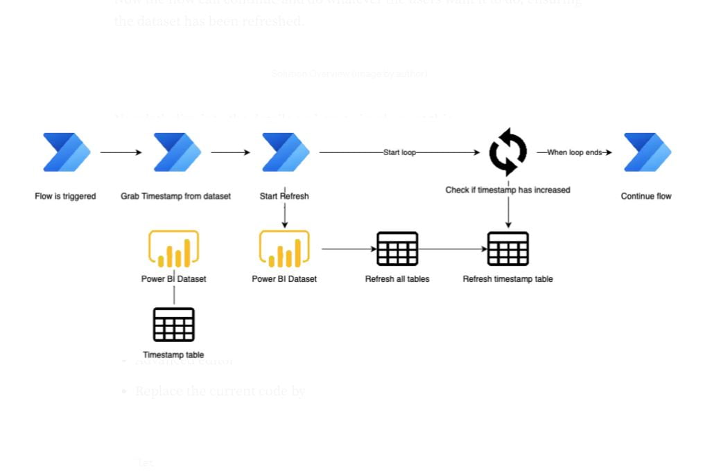
IntroductionThe Microsoft Power Platform offers a variety of solutions that integrate well with each other. Two services that are often combined are Power BI and Power Automate. You can do this by building flows to automate certain processes that interact with Power BI. One of these processes is to create a flow that triggers a […]
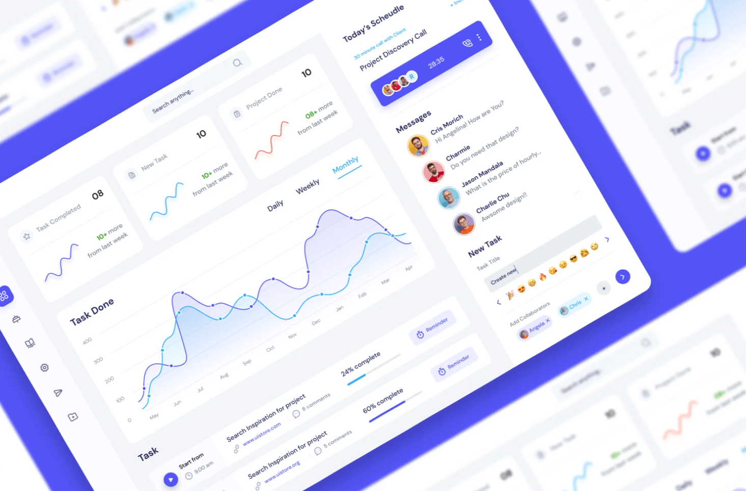
From Understanding Audiences to Mastering UI/UX: A Journey Through Engaging Report Design. Crafting a Power BI report isn’t merely about showcasing numbers or charts. It’s an art where data is woven into a narrative that’s not just informative but also intuitive, accessible, and immensely valuable to its intended audience. When you’re tasked with creating such […]
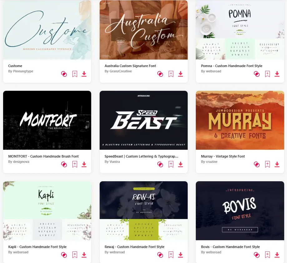
Enhancing User Experience Through Thoughtful UI and Tailored Typography. Power BI, by default, offers a select palette of font options. While these fonts are legible and professional, sometimes, there’s a need to step outside the default range to align with branding guidelines or add a distinctive aesthetic touch to your reports. But as with all […]
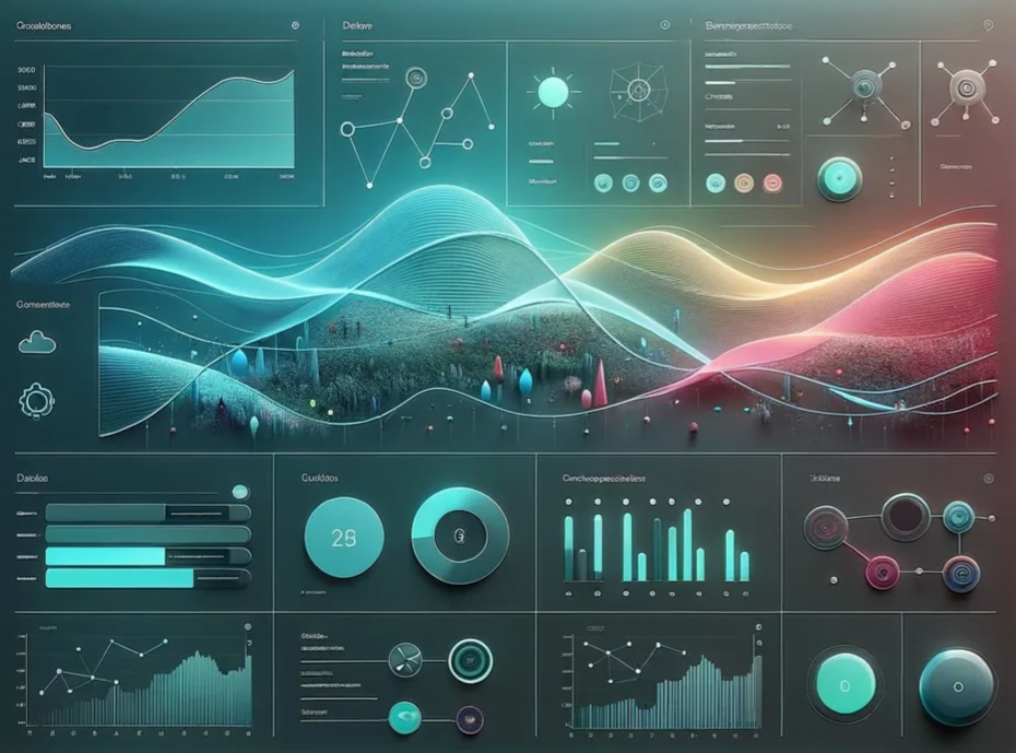
Transforming Data Interpretation: Enhancing Engagement, Insight, and Accessibility in Power BI Dashboards IntroductionThe digital age has magnified the importance of data, but the real power lies in how we interpret and act on that data. A dashboard’s primary role isn’t merely about displaying numbers — it’s about crafting an immersive and intuitive experience that translates […]


