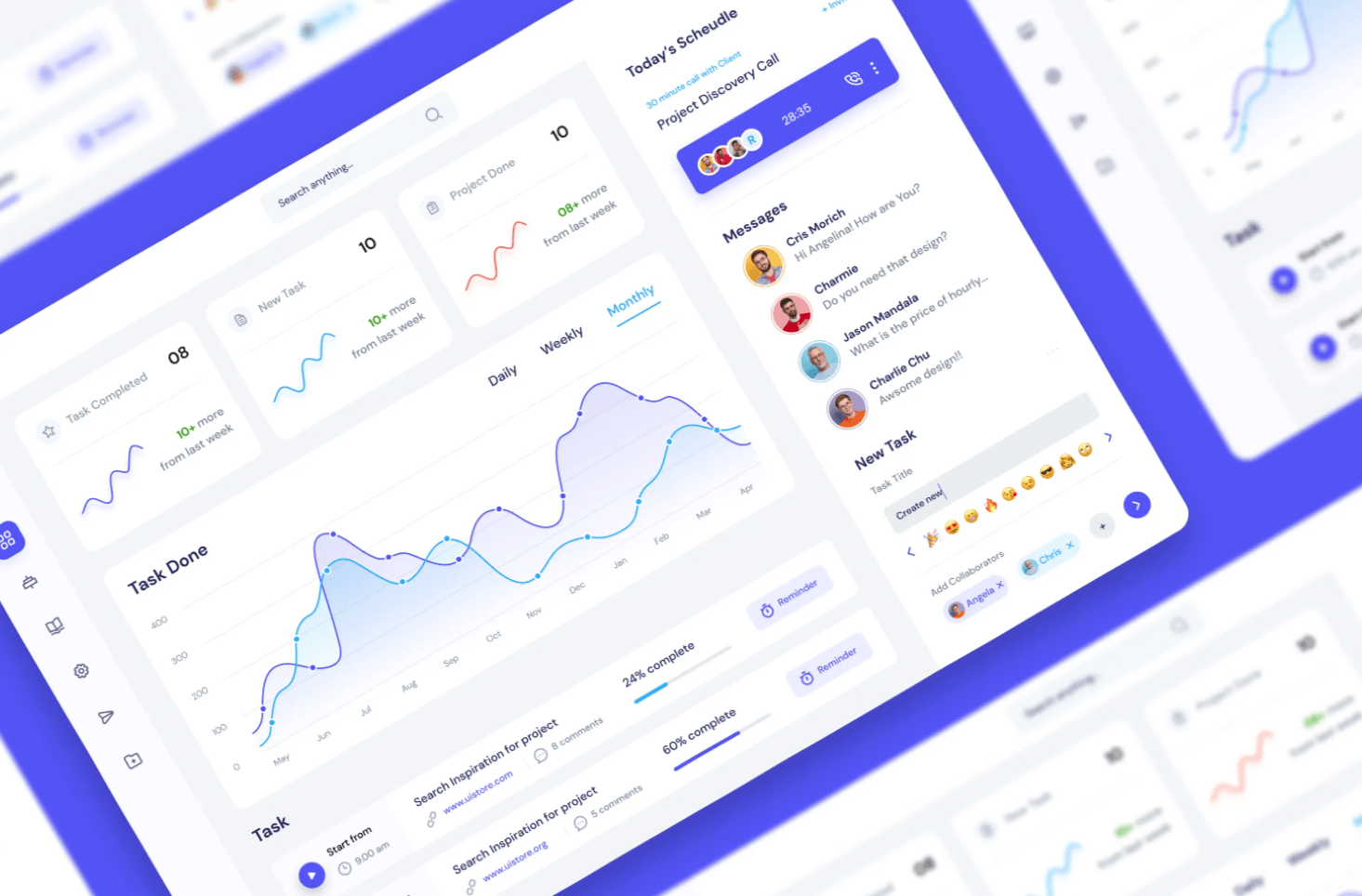
From Understanding Audiences to Mastering UI/UX: A Journey Through Engaging Report Design. Crafting a Power BI report isn’t merely about showcasing numbers or charts. It’s an art where data is woven into a narrative that’s not just informative but also intuitive, accessible, and immensely valuable to its intended audience. When you’re tasked with creating such […]
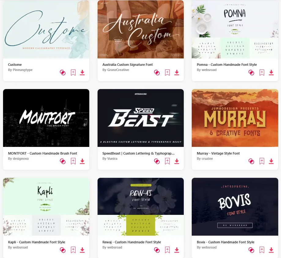
Enhancing User Experience Through Thoughtful UI and Tailored Typography. Power BI, by default, offers a select palette of font options. While these fonts are legible and professional, sometimes, there’s a need to step outside the default range to align with branding guidelines or add a distinctive aesthetic touch to your reports. But as with all […]
From Emotional Resonance to User Accessibility: Mastering Color in Dashboards Understanding the Art of Color in Design Design is more than just aesthetics; it’s about communication. And one of the most potent tools in a dashboard designer’s arsenal is colour. Through colours, we can evoke specific emotions, draw attention, and even guide user interactions. Have […]


