
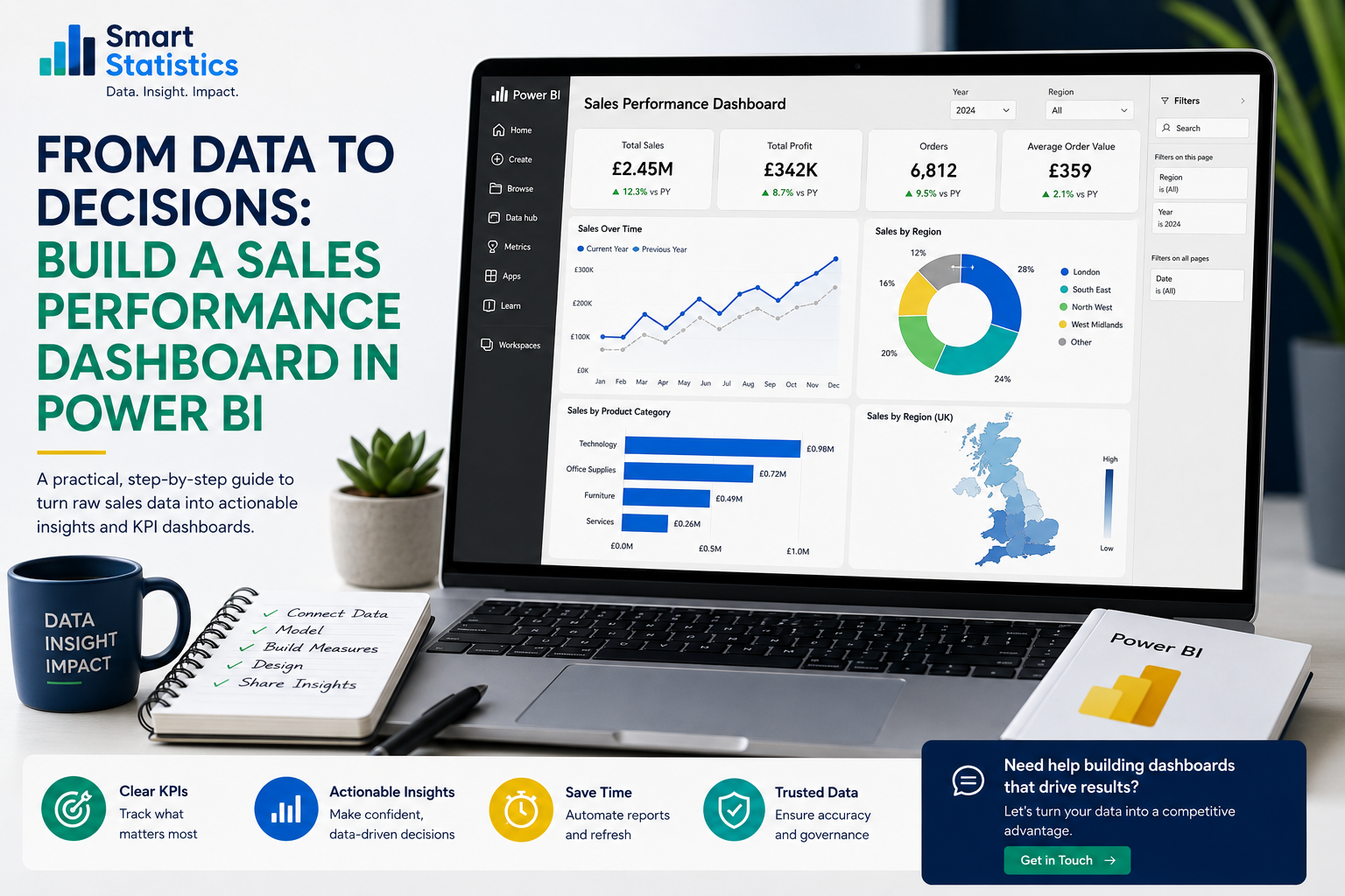
From Data to Decisions: Build a Sales Performance Dashboard in Power BI
Sales reporting becomes far more useful when managers can move beyond static spreadsheets and explore performance by product, region, salesperson and period without rebuilding the report every time.
In this practical tutorial, we will build the foundations of a professional Power BI sales dashboard: preparing the source data, creating a sensible data model, writing reusable DAX measures, choosing useful visuals and preparing the report for controlled business use.
Sales Trend
Sales by Region
Turn Sales Data into a Consistent Decision Process
A useful sales dashboard is not simply a collection of charts. It should make important questions easier to answer while reducing repeated manual reporting.
Track the Right KPIs
Bring revenue, profit, order activity and commercial efficiency measures into one consistent view.
- Total sales
- Total profit
- Profit margin
- Average order value
Spot Trends Earlier
Compare current results with previous periods and investigate significant movements.
- Monthly trends
- Year-on-year change
- Regional variation
- Product performance
Support Sales Management
Give managers a structured way to review teams, territories, customers and products.
- Salesperson performance
- Territory comparison
- Customer concentration
- Exception-led review
Create One Trusted View
Replace competing spreadsheet definitions with centrally managed measures and reporting logic.
- Shared definitions
- Reusable measures
- Controlled refresh
- Consistent reporting
Start with a Clean Sales Data Model
A simple star schema makes Power BI easier to understand, maintain and extend than a single oversized reporting table containing every field.
The Sales Fact Table
The central fact table contains the business events you want to measure. For a sales dashboard, this will commonly be an order line, invoice line or transaction.
OrderDate
CustomerKey
ProductKey
SalespersonKey
Quantity
SalesAmount
CostAmount
DimCustomer
DimProduct
DimSalesperson
DimRegion
Why Use Dimensions?
Dimension tables hold descriptive information used to group and filter the numeric events in the fact table.
For example, the product dimension might contain product name, category and brand. The customer dimension might contain customer name, segment and region.
Build the Dashboard from Start to Finish
The approach below can be adapted to sales data held in Excel, CSV files, SQL databases and other structured business systems.
Connect Power BI to your sales data
Open Power BI Desktop and choose Get Data. Connect to the source containing your sales transactions and the supporting reference tables required for analysis.
- Sales or invoice transactions
- Products and product categories
- Customers and customer groups
- Salespeople or account managers
- Regions or territories
Clean the source data in Power Query
Select Transform Data and review each query before loading it into the semantic model.
- Give columns clear business names
- Apply the correct data types
- Remove blank or invalid records
- Standardise keys
- Check duplicate transaction IDs
- Remove unnecessary columns
Create a dedicated date table
A continuous date table provides a reliable foundation for filtering and time-intelligence calculations.
DimDate =
ADDCOLUMNS(
    CALENDAR(
        DATE(2024, 1, 1),
        DATE(2027, 12, 31)
    ),
    "Year", YEAR([Date]),
    "Month Number", MONTH([Date]),
    "Month", FORMAT([Date], "MMM"),
    "Year Month", FORMAT([Date], "YYYY-MM"),
    "Quarter", "Q" & FORMAT([Date], "Q")
)
Mark the resulting table as the model's date table and create the appropriate relationship with the sales fact table.
Create the core sales measures
Measures centralise the business calculations used throughout the dashboard.
Total Sales =
SUM(FactSales[SalesAmount])

Total Cost =
SUM(FactSales[CostAmount])

Total Profit =
[Total Sales] - [Total Cost]

Profit Margin % =
DIVIDE(
    [Total Profit],
    [Total Sales]
)

Orders =
DISTINCTCOUNT(FactSales[OrderID])

Average Order Value =
DIVIDE(
    [Total Sales],
    [Orders]
)
These measures will respond automatically to filters such as year, product, region, customer and salesperson.
Add year-on-year comparison
Current values are more useful when managers can compare them with a relevant previous period.
Sales Previous Year =
CALCULATE(
    [Total Sales],
    SAMEPERIODLASTYEAR(DimDate[Date])
)

Sales YoY Change =
[Total Sales] - [Sales Previous Year]

Sales YoY % =
DIVIDE(
    [Sales YoY Change],
    [Sales Previous Year]
)
Build the first dashboard page
Design the page around the questions managers need to answer rather than around the list of available Power BI visuals.
- Place four to six headline KPIs near the top.
- Use a line chart for the sales trend.
- Use horizontal bars to rank regions or products.
- Add a matrix where detailed analysis is required.
- Keep slicers focused on useful dimensions.
Maintain consistent spacing, alignment, typography and colour usage. Visual polish should make interpretation easier rather than compete with the information.
Add useful interactivity
Use Power BI interactions to help users move naturally from the summary to the reason behind a result.
- Year and month slicers
- Region and salesperson filters
- Customer drill-through
- Report-page tooltips
- Bookmarks for alternate views
Reconcile the dashboard with the source
Before managers rely on the report, validate its important measures against the original sales or finance system.
- Check total sales for a known period
- Check order counts
- Check major customer totals
- Check product-category totals
- Check prior-year values
Keep a short validation checklist so the same tests can be repeated after significant model changes.
Publish and configure refresh
Once validation is complete, publish the report to the appropriate Power BI workspace and configure access and refresh.
- Confirm workspace ownership
- Configure source credentials
- Configure the gateway where required
- Set an appropriate refresh schedule
- Review refresh failures
- Confirm user permissions
Match the Question to the Right Chart
Good Power BI design starts with the business question. Choose the visual that communicates the answer most clearly.
KPI Card
Use for a single important value such as total sales, profit or order count.
Headline performanceLine Chart
Use to show changes over time and compare current performance with previous periods.
Trend analysisBar Chart
Use to rank products, customers, regions or salespeople clearly.
Category comparisonMatrix
Use when managers require structured detail, multiple dimensions and subtotals.
Operational detailScatter Chart
Use when exploring relationships such as sales versus profit margin across customers or products.
Relationship analysisTooltip Page
Provide additional context without filling the main report page with secondary information.
Progressive detailStart with a Small Set of Useful Measures
The exact measures depend on your commercial model, but the following provide a useful starting point for many sales dashboards.
| KPI | Business Question | Typical Use |
|---|---|---|
| Total Sales | How much revenue has been generated? | Headline performance and period comparison. |
| Total Profit | What contribution remains after the defined product or service cost? | Profitability analysis. |
| Profit Margin % | Are sales being generated at an acceptable margin? | Pricing and commercial-quality analysis. |
| Orders | How many distinct orders were placed? | Sales activity and volume analysis. |
| Average Order Value | Is average transaction value changing? | Customer and product-mix analysis. |
| Sales YoY % | How does the current period compare with the equivalent period last year? | Growth analysis. |
Make the Dashboard Reliable and Governed
A report used for business decisions needs more than attractive charts. Ownership, access, refresh and KPI definitions should all be controlled.
Security
Apply appropriate workspace, app and row-level permissions so users see only the data they are authorised to access.
Refresh
Align refresh schedules with source availability and monitor failures rather than assuming every scheduled refresh succeeded.
Definitions
Document how sales, profit, margin, orders and other important business measures are calculated.
Ownership
Define who owns the report, source data, access decisions and future changes to the model.
What Better Sales Reporting Could Improve
These examples are illustrative planning scenarios, not promised results. Actual benefits depend on your existing processes, data quality and adoption.
Reporting Time
Illustrative monthly time that might be reduced where reporting currently relies on manual spreadsheet consolidation.
Faster Analysis
Illustrative scenario where managers previously relied on static reports and repeated manual analysis.
Trusted KPI Set
A useful design objective: one governed definition for each important commercial measure.
Issue Visibility
Interactive analysis can make product, customer and regional changes easier to identify.
Power BI Sales Dashboard FAQs
What data sources can I use for a Power BI sales dashboard?
Do I need a separate date table?
Should I use calculated columns or measures?
How many KPIs should I show on the first page?
Can managers see only their own sales territory?
Can Smart Statistics build the dashboard for us?
Ready to Build a Sales Dashboard Your Team Can Actually Use?
Smart Statistics helps UK businesses turn fragmented sales data into clear, governed reporting that supports better commercial decisions.
Whether you need a new Power BI dashboard, a better data model, DAX support, reporting automation or an independent review of an existing solution, we can help.