Dashboard Design
Create clear, structured dashboards with intuitive layouts, meaningful visual hierarchy and decision-focused content.

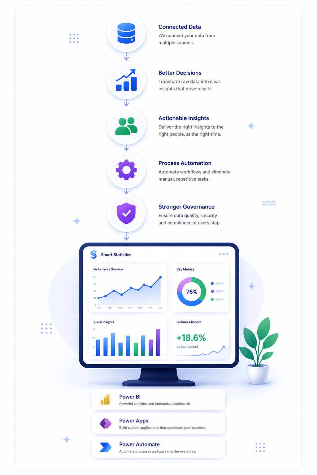
We transform complex business data into clear visual stories that help decision-makers understand performance, identify trends and act with greater confidence.
Organisations often collect large volumes of information but present it through overcrowded reports, confusing charts or spreadsheets that make important messages difficult to identify.
We simplify complex information and create visual experiences that guide users towards the insights, exceptions and decisions that matter.
We combine business understanding, analytical thinking and visual design to create reporting experiences that communicate information clearly and support confident decisions.
Create clear, structured dashboards with intuitive layouts, meaningful visual hierarchy and decision-focused content.
Present data as a coherent story that explains what happened, why it matters and where attention is required.
Choose the most appropriate visual format for comparisons, trends, distributions, relationships and performance measures.
Transform cluttered or inconsistent reports into cleaner, faster and more effective reporting experiences.
Design concise visual summaries for leadership teams, boards, investors and senior decision-makers.
Establish repeatable layouts, colours, chart standards and design principles across your reporting environment.
Effective data visualisation is not decoration. Every design decision should make information clearer, reduce cognitive effort and help users reach the correct conclusion.
We remove unnecessary visual noise and focus attention on the information that supports the intended decision.
Important messages are prioritised through structure, scale, position and controlled use of colour.
Each visual is chosen according to the analytical question rather than appearance or novelty.
Colours, labels, terminology and interactions remain consistent so users do not need to relearn each report.
Performance is supported by targets, comparisons, trends and explanations rather than isolated numbers.
Layouts, colours, labels and navigation are designed to work for a broad range of users and devices.
Clear visual communication enables users to process information faster, recognise important changes and make decisions with greater confidence.
Reduce the effort required to interpret complex business information.
Make changes, exceptions and emerging patterns easier to recognise.
Create reporting experiences people are more likely to use and trust.
Present relevant information in a format that encourages confident action.
We begin with the audience and business purpose before choosing charts, colours or layouts. This ensures the final design supports real decisions rather than simply presenting available data.
We identify the intended audience, key questions, business objectives and existing reporting challenges.
We define the information hierarchy, narrative flow, measures, visual priorities and user journeys.
We develop the dashboard layouts, charts, interactions and visual standards through iterative reviews.
We test the visual experience with users and refine it for clarity, accessibility and practical business use.
The result is a reporting experience that makes complex information easier to navigate, understand and communicate across the organisation.
We do not design dashboards purely for appearance. We combine business analysis, reporting expertise and visual communication to create solutions that improve understanding and decision-making.
Every design choice is linked to a business question, user need or decision that the visualisation must support.
We simplify complex information without removing the context users need to reach reliable conclusions.
We help establish repeatable visual principles that can be used across future dashboards and reports.
Yes. We can review existing dashboards and improve their layout, visual hierarchy, chart selection, navigation, accessibility and overall usability without necessarily rebuilding the complete reporting solution.
Chart selection is based on the question the user needs to answer. Comparisons, trends, distributions, relationships and part-to-whole analysis each require different visual approaches.
Yes. We can define reusable standards covering colours, typography, chart selection, layouts, KPI presentation, navigation, labels and accessibility. These standards can help create a more consistent reporting environment.
Yes. We consider colour contrast, font sizing, labelling, navigation, reliance on colour and the clarity of visual elements so dashboards can be used by a broader audience.
Yes. Where mobile access is required, we can design simplified responsive layouts that prioritise the most important measures and interactions for smaller screens.
Our primary focus is Power BI and business reporting environments, but the underlying principles of information design, visual hierarchy and data storytelling can also be applied to presentations, management reports and other analytical outputs.
Whether you need a new visual reporting experience, want to redesign existing dashboards or require consistent visual standards across your organisation, we would be happy to discuss your requirements.