
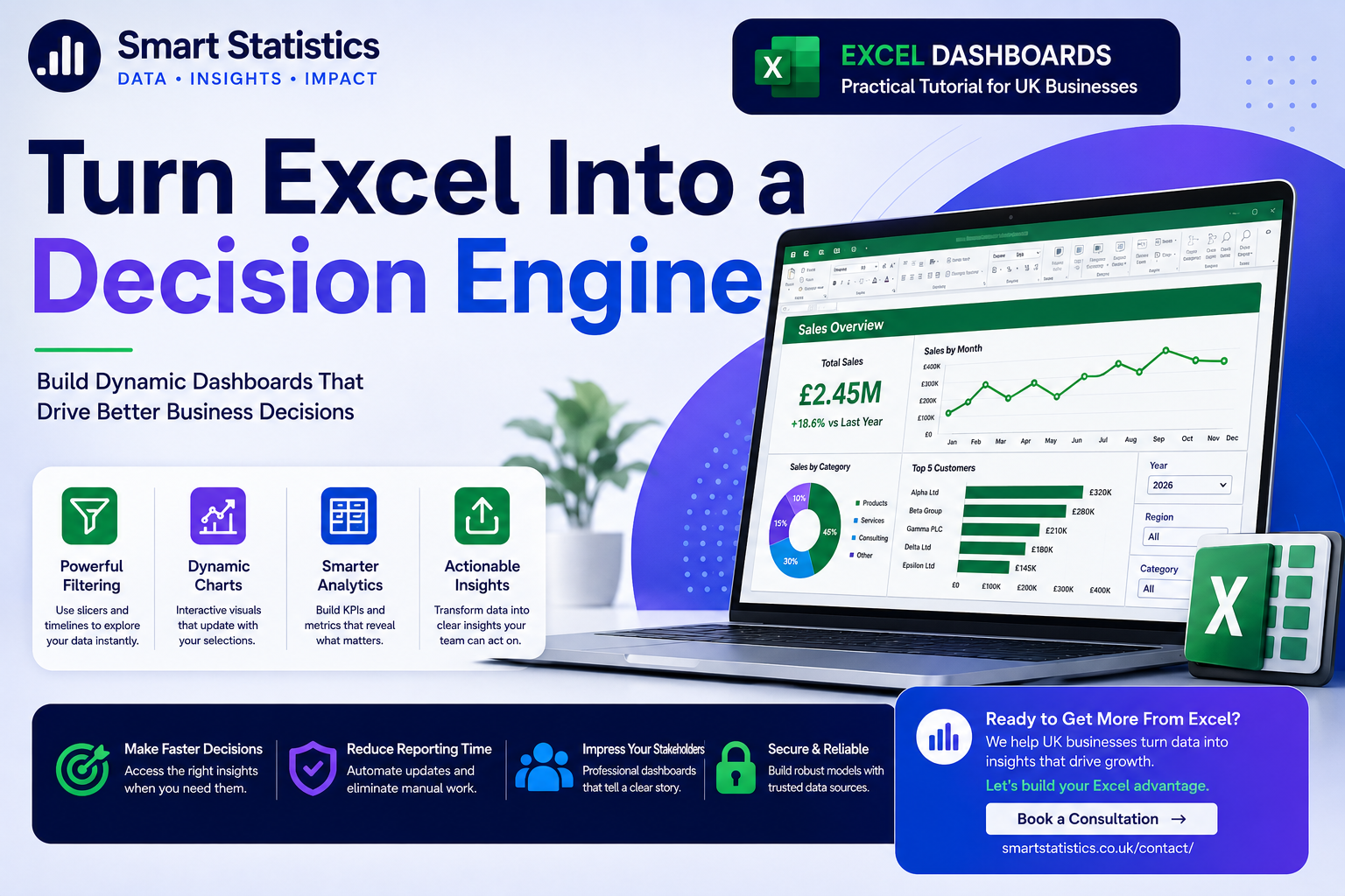
Turn Excel Into a Decision Engine: Build a Dynamic Management Dashboard
Excel is often treated as a place to store numbers, perform calculations and send monthly reports. Used properly, it can do much more.
With structured data, reusable formulas, PivotTables, slicers and disciplined dashboard design, Excel can become an interactive management reporting tool that helps decision-makers understand performance quickly.
Design Around Decisions, Not Spreadsheet Features
A useful management dashboard should allow a user to understand current performance, identify variance and decide where attention is required without navigating through dozens of worksheets.
Current Performance
Show the few headline measures management needs to understand immediately.
- Revenue
- Profit
- Margin
- Orders or customers
Trend
Show whether the result is improving, deteriorating or behaving unexpectedly over time.
- Monthly movement
- Previous-year comparison
- Seasonality
- Unusual changes
Business Drivers
Break the headline result down by the dimensions managers actually control.
- Region
- Category
- Customer
- Product or service
Action
A dashboard should make the next question obvious, rather than simply displaying attractive charts.
- What changed?
- Where?
- Why?
- What needs action?
Your Dashboard Starts with a Proper Excel Table
Avoid building dashboard formulas directly against manually maintained ranges such as A2:G5000. Convert the source into an Excel Table instead.
| Column | Purpose | Example |
|---|---|---|
| Date | Transaction date used for year and month analysis. | 18/08/2026 |
| OrderID | Unique transaction or order reference. | ORD-10458 |
| Customer | Customer or account name. | Alpha Ltd |
| Region | Reporting geography or business area. | Midlands |
| Category | Product or service grouping. | Services |
| Revenue | Sales value for the transaction. | 2450 |
| Cost | Direct cost associated with the transaction. | 1610 |
Build the Dashboard from the Data Up
The following examples assume your Excel Table is named tblSales.
Add a Profit calculated column
Add a new column called Profit inside tblSales.
=[@Revenue]-[@Cost]
Because the data is stored as an Excel Table, the formula automatically fills the entire calculated column and extends to new rows.
Add Margin %
=IFERROR([@Profit]/[@Revenue],0)
Format the column as Percentage.
Add a Month Start column
A real date is more useful than storing month names as text.
=DATE(YEAR([@Date]),MONTH([@Date]),1)
Format the result as mmm yyyy.
This preserves chronological sorting and works cleanly in PivotTables and charts.
Create dashboard controls
On the Dashboard sheet create two selection cells:
- B3 → Selected Year
- B4 → Selected Region
Use Data Validation dropdowns rather than allowing managers to type arbitrary values.
For Region, include an All option.
Calculate Total Revenue dynamically
=LET(
    StartDate,DATE($B$3,1,1),
    EndDate,DATE($B$3+1,1,1),
    SelectedRegion,$B$4,
    IF(
        SelectedRegion="All",
        SUMIFS(
            tblSales[Revenue],
            tblSales[Date],">="&StartDate,
            tblSales[Date],"<"&EndDate
        ),
        SUMIFS(
            tblSales[Revenue],
            tblSales[Date],">="&StartDate,
            tblSales[Date],"<"&EndDate,
            tblSales[Region],SelectedRegion
        )
    )
)
LET makes longer formulas easier to understand by assigning readable names to repeated values.
The formula returns annual revenue for the selected year and optionally filters to the selected region.
Calculate Total Profit
=LET(
    StartDate,DATE($B$3,1,1),
    EndDate,DATE($B$3+1,1,1),
    SelectedRegion,$B$4,
    IF(
        SelectedRegion="All",
        SUMIFS(
            tblSales[Profit],
            tblSales[Date],">="&StartDate,
            tblSales[Date],"<"&EndDate
        ),
        SUMIFS(
            tblSales[Profit],
            tblSales[Date],">="&StartDate,
            tblSales[Date],"<"&EndDate,
            tblSales[Region],SelectedRegion
        )
    )
)
Use the same filtering pattern across all headline measures so dashboard behaviour remains consistent.
Calculate overall Margin %
Assume the Total Revenue KPI is in B8 and Total Profit is in B9.
=IFERROR(B9/B8,0)
Calculate Revenue Last Year
=LET(
    StartDate,DATE($B$3-1,1,1),
    EndDate,DATE($B$3,1,1),
    SelectedRegion,$B$4,
    IF(
        SelectedRegion="All",
        SUMIFS(
            tblSales[Revenue],
            tblSales[Date],">="&StartDate,
            tblSales[Date],"<"&EndDate
        ),
        SUMIFS(
            tblSales[Revenue],
            tblSales[Date],">="&StartDate,
            tblSales[Date],"<"&EndDate,
            tblSales[Region],SelectedRegion
        )
    )
)
Create the year-on-year change
Assume Current Revenue is B8 and Last Year Revenue is B11.
=IFERROR((B8-B11)/B11,0)
Format the result as Percentage.
Apply conditional formatting so positive and negative movements can be identified quickly.
Build the monthly trend PivotTable
Insert a PivotTable from tblSales and place it on a dedicated sheet such as PivotData.
- Rows → Month Start
- Values → Sum of Revenue
- Filters or slicers → Region
Create a line chart from this PivotTable.
Create category performance
Create another PivotTable:
- Rows → Category
- Values → Sum of Revenue
- Sort → Largest to Smallest
A horizontal bar chart is often easier to read than a pie chart when several categories exist.
Build a Top Customers view
Create a PivotTable with:
- Rows → Customer
- Values → Sum of Revenue
- Value Filter → Top 10
This makes concentration risk and important customer movements much easier to see.
Add slicers
From a PivotTable, choose:
- PivotTable Analyse
- Insert Slicer
- Choose Region, Category or another useful dimension
Use Report Connections to connect one slicer to multiple PivotTables that use the same source.
Design the one-screen management view
A strong page structure might be:
- Top row → Revenue, Profit, Margin and YoY Change
- Middle left → Monthly trend
- Middle right → Category or regional performance
- Bottom → Top customers or detailed exceptions
Remove worksheet gridlines from the Dashboard sheet and use consistent spacing, fonts and number formats.
Protect the dashboard from accidental edits
Lock calculation cells and visual-support areas while leaving intended selector cells editable.
Then use worksheet protection to reduce the risk of somebody overwriting a critical formula during a management meeting.
Test with new data
Add several new records to tblSales and confirm:
- Calculated columns extend automatically
- KPI formulas include the new rows
- PivotTables refresh correctly
- Slicers still control the correct visuals
- Date selections produce the expected totals
Keep the Headline View Simple
The values below are illustrative only. The principle is to make each KPI answer a distinct management question.
Know When Excel Is Still Right — and When It Is Time to Scale
A well-designed workbook can be an excellent reporting solution, but it should not be forced to solve every enterprise reporting problem.
Controlled Ownership
Assign a named owner for the workbook, source data, calculations and reporting timetable.
Defined Metrics
Document key definitions so Revenue, Profit, Margin and other measures are calculated consistently.
Access Control
Store the workbook in a controlled location such as SharePoint or Microsoft Teams rather than circulating independent email copies.
Scale When Necessary
Consider Power BI when distribution, governance, model size, security or cross-business reporting starts exceeding what the workbook can manage cleanly.
Excel Management Dashboard FAQs
Can Excel really be used for management dashboards?
Should I use formulas or PivotTables?
Why should I use an Excel Table?
Can slicers control more than one PivotTable?
How should I distribute the dashboard?
When should I move the dashboard to Power BI?
Can I automate the Excel data refresh?
How can Smart Statistics help?
Is Your Excel Reporting Helping People Decide — or Just Giving Them More Data?
Smart Statistics helps UK businesses turn spreadsheets into structured, reliable management reporting that is easier to update, understand and act on.
Whether you need an Excel dashboard, Power Query automation, Power BI reporting or a broader data solution, we can help design the right approach.