
Power BI Dashboards That Drive Better Business Decisions
A good dashboard does more than display charts. It focuses attention on the decisions that matter, makes performance visible and gives leaders a trusted view of what is happening across the organisation.
This guide explains how UK businesses can design Power BI dashboards that are clear, useful, governed and genuinely connected to action.
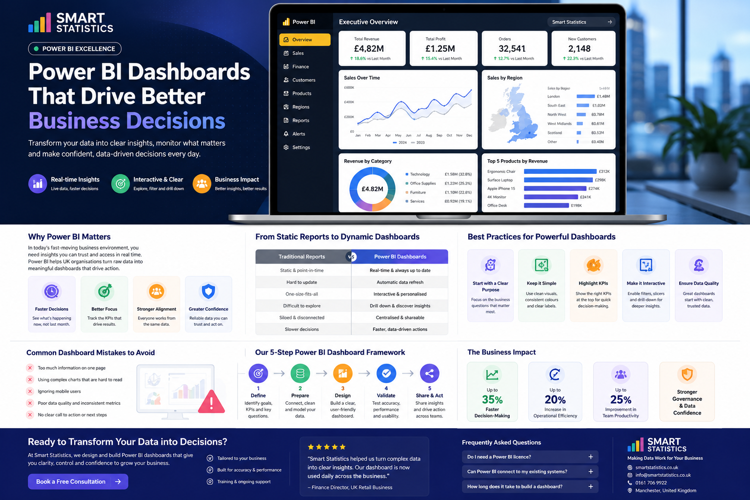
Sales Performance Trend
Revenue by Region
Turn Business Data into Clear Direction
Power BI can bring finance, sales, operations, customer and workforce information into a shared reporting experience. The real value comes from designing that experience around business questions rather than around available data.
Faster Decisions
Replace slow reporting cycles with timely visibility of current performance, exceptions and trends.
- Automated refresh
- Current KPI status
- Reduced reporting delay
Better Focus
Direct attention towards the measures, thresholds and business questions that matter most.
- Relevant KPI selection
- Clear performance targets
- Exception-led reporting
Stronger Alignment
Create a shared view of performance so teams work from the same definitions and evidence.
- Consistent measures
- Common reporting language
- Shared accountability
Greater Confidence
Combine governed data, transparent calculations and clear ownership to increase trust in reporting.
- Controlled data models
- Documented calculations
- Clear data ownership
From Static Reports to Dynamic Dashboards
Traditional reports often describe what happened. A well-designed Power BI dashboard helps users investigate performance, identify drivers and decide what should happen next.
| Reporting Area | Traditional Reports | Power BI Dashboards |
|---|---|---|
| Timeliness | Point-in-time reporting that may already be out of date when distributed. | Scheduled or near-real-time refresh aligned to operational requirements. |
| Exploration | Fixed pages with limited ability to investigate causes or exceptions. | Filters, drill-through, tooltips and detail views support deeper analysis. |
| Personalisation | One version is distributed to every user regardless of role. | Role-based pages and security can present relevant information to each audience. |
| Consistency | Multiple spreadsheets may calculate the same KPI differently. | Central measures and semantic models support shared definitions. |
| Distribution | Email attachments create version-control problems. | Centralised access provides one governed source of reporting. |
| Decision Support | Users interpret figures manually and may miss important context. | Targets, variance, commentary and exceptions guide attention and action. |
Best Practices for Powerful Dashboards
Effective dashboards are intentionally selective. They show enough information to support a decision without overwhelming the user or hiding the business story.
Start with Purpose
Define the decisions, users and questions before choosing visuals or building measures.
Keep It Simple
Use clear layouts, limited colour, readable labels and consistent visual hierarchy.
Highlight KPIs
Place the most important measures, targets and variances where users see them first.
Make It Interactive
Use filters and drill-through where they help answer a real follow-up question.
Our Five-Step Power BI Dashboard Framework
A structured process keeps dashboard development focused on business value, data quality and sustainable adoption.
Define
Clarify users, decisions, business questions, KPIs, targets and success criteria.
Prepare
Connect, clean, reconcile and model the data required for reliable reporting.
Design
Create a clear visual hierarchy with relevant interactions and accessible layouts.
Validate
Test calculations, security, refresh, usability, performance and mobile behaviour.
Share and Act
Publish, train users, monitor adoption and build reporting into management routines.
Common Dashboard Mistakes to Avoid
Many dashboard problems are design and governance problems rather than technical limitations.
Too Much Information
Trying to place every measure on one page weakens focus and increases cognitive load.
Complex Visuals
Novel chart types can distract users when a simple line, bar or table would communicate faster.
Ignoring Mobile Users
Executives and field teams may need a dedicated mobile layout rather than a compressed desktop page.
Weak Data Governance
Inconsistent definitions, manual overrides and unclear ownership quickly undermine trust.
What Better Dashboards Can Improve
The examples below are illustrative outcomes, not guaranteed results. Actual impact depends on the organisation, reporting baseline, adoption and implementation scope.
Faster Decision-Making
Reduce the delay between a performance change and management action.
Operational Efficiency
Reduce manual report preparation, distribution and repeated reconciliation.
Team Productivity
Give teams self-service access to trusted information and reduce reporting queues.
Governance and Confidence
Improve consistency, transparency and ownership across management reporting.
Power BI Dashboards: Questions Answered
Do we need a Power BI licence?
Can Power BI connect to our existing systems?
How long does it take to build a dashboard?
Can Power BI replace Excel reporting?
How do we make users adopt the dashboard?
How can Smart Statistics help?
Ready to Turn Your Data into Better Decisions?
Smart Statistics designs and develops Power BI dashboards that give UK organisations greater clarity, control and confidence in their reporting.
Whether you need an executive dashboard, operational reporting, a Power BI health check or a wider data strategy, we can help you create a practical solution focused on measurable business value.