
Your Dashboard Doesn't Need Another Chart — It Needs Decisions
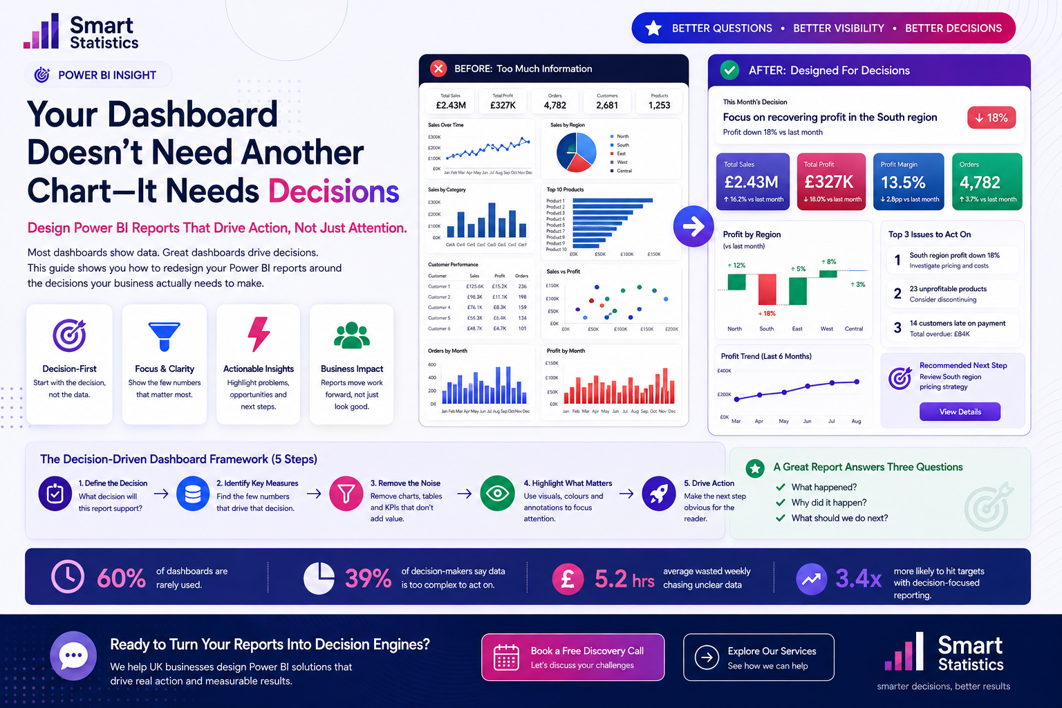
Power BI makes it remarkably easy to add another visual. That becomes a problem when the report turns into a wall of cards, charts, tables and slicers that leaves the user to decide for themselves what matters.
Executive reporting should do the opposite. It should compress complexity, identify the exceptions that deserve attention and reduce the distance between information and action.
Here is the test: if an executive has only five minutes with your dashboard, can they understand what changed, why it changed and what should happen next?
Profit Variance by Region
Illustrative comparisonProfit Trend
Illustrative six-month trendIssues Requiring Action
Example decision queueMore Information Does Not Automatically Create Better Decisions
A report can be technically correct and beautifully formatted while still asking the user to perform too much interpretation before they understand what deserves attention.
KPI Wallpaper
Ten or fifteen cards across the top of a dashboard can make every metric appear equally important. When everything is emphasised, nothing is prioritised.
Filter Dependency
If a user must manipulate multiple slicers before discovering the problem, the report is asking them to investigate before it has told them where to look.
Context-Free Numbers
Revenue of £2.4 million means little without target, previous period, budget, forecast or another comparison that explains whether the result is actually good.
No Next Step
A report can clearly expose a problem while still leaving the reader unsure where to investigate, who owns the issue or what should happen next.
A Strong Executive Page Answers Three Questions
What happened?
Show the few measures that establish the current position and highlight material change.
Why did it happen?
Use variance, trend, segmentation and exception analysis to expose the likely drivers.
What should we do next?
Direct attention towards the customer, region, product, team or process that requires action.
Give Your Dashboard the 5-Minute Executive Test
Imagine the user opens your dashboard five minutes before their next meeting, with nobody beside them to explain it.
The test is deliberately unforgiving.
Do not explain the report. Let the dashboard communicate for itself.
Decision Readiness Score
Select each statement your dashboard genuinely satisfies without verbal explanation.
Turn the Dashboard into a Decision System
Define the decision before the visual
Start by writing the management question the dashboard must help answer.
- Which region needs intervention?
- Where are we losing margin?
- Which customers are creating overdue exposure?
- Which operational area is missing target?
Identify measures that change the decision
For every KPI, ask whether seeing that number changes what the user will actually do.
- Does it explain performance?
- Does it affect prioritisation?
- Does the user act differently because they saw it?
Replace absolute values with context
A KPI should rarely stand alone. Give the user enough comparative context to interpret it immediately.
- Target
- Budget
- Previous period
- Same period last year
- Forecast
- Tolerance
Make exceptions visually louder
Ordinary performance should not compete visually with something requiring immediate management attention.
- Increase prominence for important exceptions.
- Use conditional emphasis intentionally.
- Add concise explanatory annotations.
- Rank issues where prioritisation matters.
Make the next investigation obvious
A dashboard does not need to make every business decision automatically, but it should reduce the distance between recognising a problem and investigating it.
- Drill through to the affected customer.
- Navigate directly to the underperforming site.
- Surface products driving a margin issue.
- Expose overdue transactions.
- Link the report to the operational process.
The Same Data Can Produce a Completely Different Experience
"Here is everything we know."
"Here is what needs your attention."
A Decision Dashboard Should Become Part of the Management Process
The strongest reporting solutions become part of meetings, reviews, escalations and follow-up actions rather than sitting separately from the way the business operates.
Refresh Before the Decision
Align refresh timing with the management process that consumes the information.
Push Important Information
Use subscriptions or automation when important reporting should reach users on a defined schedule.
Give Every KPI an Owner
Responsibility for important performance measures should exist outside the reporting team.
Review Adoption
If the intended audience is not using the dashboard, investigate relevance and usability before adding more content.
Decision-Driven Power BI FAQs
How many KPIs should an executive dashboard contain?
Does a simpler dashboard mean less analysis?
Should I remove slicers from executive reports?
Should every KPI use red, amber and green?
Should executives and analysts use the same report?
Can Power BI reports support proactive reporting?
How should we test whether a dashboard is working?
How can Smart Statistics help?
Your Executives Don't Need More Data. They Need Less Distance Between Data and Action.
Smart Statistics helps UK businesses turn complex reporting into decision-focused Power BI solutions that make important changes visible, explain what is driving them and guide users towards the right next step.
If your current dashboards are technically impressive but difficult to act on, the solution may not be another visual. It may be a better reporting question.